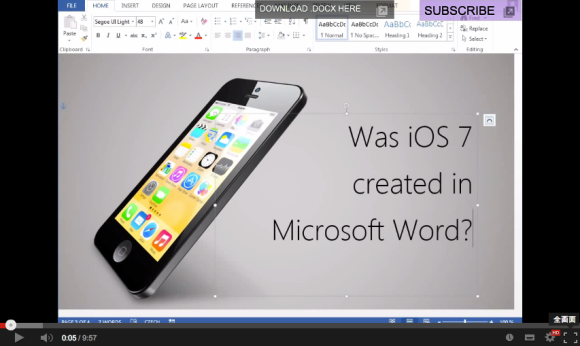
Since its release in 2007, the iPhone has taken the world by storm, garnering a massive following thanks to its simplistic design and sleek interface. Along with the gradual changes of its appearance, its operating system, iOS, has also made subtle changes with each update since the first version.
iOS 7, which was rolled out a couple of months ago, surprised users with a revamped look and feel which seemed to challenge the limits of simplicity with a flat user interface and bold colors. Doing away with excessive ornamentation, the explicitly simple design set some people thinking, was iOS 7 created in Microsoft Word? Václav Krejčí from the Czech Republic worked his magical skills with the word processing software to create an image replica of unbelievable quality, and you should really see it with your own eyes.
The entire replication process was documented in a clearly explained video, showing all the tools and tricks used to create the iOS 7 lookalike in Microsoft’s word processing software. Every default iOS icon was recreated with detail, entirely in Word.
▼ Creating the rounded rectangle icons and using a grid for alignment.
▼ Tracing lines to replicate irregular shapes.
▼ Manipulating symbols and shapes to recreate icons.
▼ Playing with colors and gradients.
▼ Recreating complex details using simple shapes.
▼ Replicating the body of the mobile device.
▼ Mapping on the face and dropping a shadow.
Many of our writers here at RocketNews24 use Microsoft Word to produce articles every single day, but to be honest we never imagined that the text editing software could achieve such visual intensity! You’ll have to see it to believe it.
That proves it, the iOS 7 user interface was designed in Microsoft Word. Or was it not? Well, that’s one trade secret that we’ll never know, but one thing we know for sure is that Václav Krejčí’s proficiency in creating images in a Word document is off the charts. Be sure to check out his YouTube channel to learn more fancy image conjuring tricks!
Source: Jandan
Images: YouTube