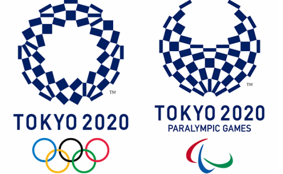
Could the clever designs also hold an undisclosed message?
After all the controversy that was caused by the possibly plagiarized logos that were originally intended to be the emblems of the 2020 games, the recently announced new official designs haven’t run into any problems so far. The winning logo features an assortment of quadrilaterals arranged in a circular shape that is titled “Harmonized Checkered Emblem”. This design pulls its inspiration from Japanese history as the checkered pattern called ichimatsu moyo came about in the Edo period (1603-1867). The particular shade of blue is also a traditional color, one that stands for elegance and sophistication. According to the designer, Asao Tokolo, the variety of rectangles is meant to represent different countries, cultures, and ways of thinking.
As nice as all of that sounds, the logos are actually a lot cooler than you might think. Thanks to a bit of analysis, it’s clear that the two logos, the one for the Tokyo Olympic Games and the one for the Tokyo Paralympic Games, can actually morph into each other just by moving some of the rectangles around.
エンブレム、うちの教授が分析しとった。大きな24角形とその対角線から出来る12角形。それぞれの長方形はその12角形の頂点をお結んだもの。だと。見つけ出すのに3時間かかったって。 pic.twitter.com/K5RMV5vSlS
— ibuki (@ibuki7) April 26, 2016
枚数が同じどころじゃなかった。パーツごとの角度も変えないままオリンピックからパラリンピックにできる pic.twitter.com/TIv4IruvM8
— 鯵坂もっちょ🐟『つれづれなる数学日記』発売中 (@motcho_tw) April 26, 2016
Could it be that the message of “unity in diversity” in the Olympic games also extends to a unifying statement about the two events, how the athletes for the two games may be different, but that they both possess the same drive to become the best in their sport? As the two logos are made up of the exact same parts, but look a little different, so too do the athletes for both the Olympic and Paralympic games.
Even if that wasn’t the original intent of Tokolo, we can still hear the message loud and clear within his ingenious visual design. After the debacle of the original logos, these designs are definitely ones that we can get behind.
Sources: My Game News Flash, Tokyo 2020
Images: Tokyo 2020