Stroll into virtually any games store and, alongside a wall of lime and dark green that marks the domain of Microsoft’s Xbox 360 and Xbox One, you’ll now find the sea of blue that is the PlayStation section. With its latest console, Sony went with dark blue for the majority of its packaging, with all games shipping in cases with dark blue headers stamped with the stylish “PS4” logo. The cases are the exact same colour as those for Sony’s portable console, PlayStation Vita, though since Vita game cards are so ridiculously tiny the cases are roughly half the size of the PS4’s.
But now, PlayStation 3 games wearing the same colours as their PS4 and Vita brethren have begun showing up in stores. Clearly Sony is aiming for a unified look across its PlayStation brand, but some gamers in Japan are not exactly pleased about the change and say that the new packaging is confusing.
In the past, physical copies of PlayStation 3 games shipped in cases made from clear plastic. Here’s this writer’s personal Game of the Year for 2013, The Last of Us, in its game case.
And here’s a typical PS4 game case:
But it turns out that newer releases for PlayStation 3 will be arriving in packaging that looks just like PS4 and PS Vita games’ own.
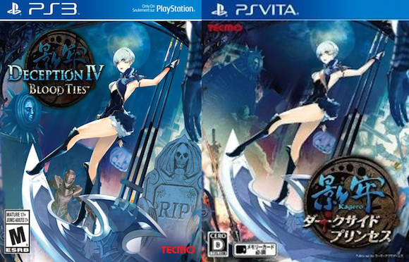
The only concrete example of the new-look cases so far is recently released title Deception IV: Blood Ties, which appears on both PS3 and PS Vita. For comparison’s sake, we’re resized the images, but as you can see, in terms of visual design they’re almost exactly the same.
▼ So much blue!
Personally, I quite like the uniform look, and since I download more than half of my games direct from the PlayStation Store these days, a game case colour change isn’t really going to affect me. But then again, with PS3 coming to the end of its lifespan it does seem odd to ruin the visual aesthetic of gamers’ physical collections by having the colour scheme suddenly change. If you’re the kind of person who simply must have their PlayStation logo turned the right way up when moving the console from standing to lying flat, that kind of thing is definitely going to annoy you.
But otherwise, a little change in colour is no biggie, right?
Wrong. Along with a few comments about Sony having already meddled with the PS3’s box art before (up until a couple of years ago, the standard PS3 font was slanted to the right and looked remarkably like that of the Spider-Man reboot movies), some gamers in Japan are suggesting that having three systems’ games all in similar packaging is simply “confusing” and will result in “accidental” purchases, especially by those buying games for others who aren’t overly familiar with the consoles. One person, perhaps half jokingly, even suggested that Sony was doing this on purpose to trick people into buying the wrong version, though we fail to see how that would benefit any of the parties involved.
True, the colour change may result in one or two accidental purchases at first, or perhaps even staff in game stores grabbing the wrong version of a game without realising it, but really if you have that much trouble differentiating between a box that says “PS3” and one that has “PS4” written on it, then I don’t know how you even begin to manage doing things like choosing the right floor in an elevator. After all, apart from the different numbers clearly printed on them, all of those buttons do look remarkably similar…
Source/images: Jin
Infamous box art via Newgrounds