
Stroll into virtually any games store and, alongside a wall of lime and dark green that marks the domain of Microsoft’s Xbox 360 and Xbox One, you’ll now find the sea of blue that is the PlayStation section. With its latest console, Sony went with dark blue for the majority of its packaging, with all games shipping in cases with dark blue headers stamped with the stylish “PS4” logo. The cases are the exact same colour as those for Sony’s portable console, PlayStation Vita, though since Vita game cards are so ridiculously tiny the cases are roughly half the size of the PS4’s.
But now, PlayStation 3 games wearing the same colours as their PS4 and Vita brethren have begun showing up in stores. Clearly Sony is aiming for a unified look across its PlayStation brand, but some gamers in Japan are not exactly pleased about the change and say that the new packaging is confusing.
In the past, physical copies of PlayStation 3 games shipped in cases made from clear plastic. Here’s this writer’s personal Game of the Year for 2013, The Last of Us, in its game case.
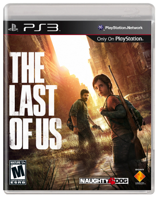 Image: Projectcoe
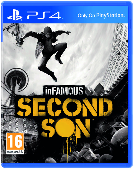
And here’s a typical PS4 game case:
But it turns out that newer releases for PlayStation 3 will be arriving in packaging that looks just like PS4 and PS Vita games’ own.
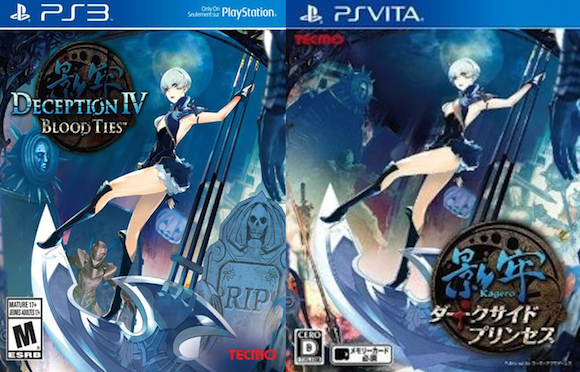
The only concrete example of the new-look cases so far is recently released title Deception IV: Blood Ties, which appears on both PS3 and PS Vita. For comparison’s sake, we’re resized the images, but as you can see, in terms of visual design they’re almost exactly the same.
▼ So much blue!
Personally, I quite like the uniform look, and since I download more than half of my games direct from the PlayStation Store these days, a game case colour change isn’t really going to affect me. But then again, with PS3 coming to the end of its lifespan it does seem odd to ruin the visual aesthetic of gamers’ physical collections by having the colour scheme suddenly change. If you’re the kind of person who simply must have their PlayStation logo turned the right way up when moving the console from standing to lying flat, that kind of thing is definitely going to annoy you.
But otherwise, a little change in colour is no biggie, right?
Wrong. Along with a few comments about Sony having already meddled with the PS3’s box art before (up until a couple of years ago, the standard PS3 font was slanted to the right and looked remarkably like that of the Spider-Man reboot movies), some gamers in Japan are suggesting that having three systems’ games all in similar packaging is simply “confusing” and will result in “accidental” purchases, especially by those buying games for others who aren’t overly familiar with the consoles. One person, perhaps half jokingly, even suggested that Sony was doing this on purpose to trick people into buying the wrong version, though we fail to see how that would benefit any of the parties involved.
True, the colour change may result in one or two accidental purchases at first, or perhaps even staff in game stores grabbing the wrong version of a game without realising it, but really if you have that much trouble differentiating between a box that says “PS3” and one that has “PS4” written on it, then I don’t know how you even begin to manage doing things like choosing the right floor in an elevator. After all, apart from the different numbers clearly printed on them, all of those buttons do look remarkably similar…
Source/images: Jin
Infamous box art via Newgrounds
 Sony announces PlayStation 4 release date at Gamescom 2013 *UPDATED*
 Sony’s new Xperia Z3 compact tablet boasts PlayStation 4 remote play, controller mount
 End of an era – Sony announces end of online, PlayStation Store support for PS3 and Vita
 PlayStation 4 impressions: An Xbox fan and a Sony lover go head to head
 Japanese convenience store releases Japanese convenience store-flavor fried chicken
 Cup Noodle releases cold-water instant ramen in Japan, but can it really be made with just cold water?
 Hatsune Miku collaborates with Hokusai’s art in new Vocaloid ukiyo-e illustration series [Pics]
 Studio Ghibli releases anime T-shirts that pay homage to one of Hayao Miyazaki’s most personal films
 Japan’s “edible fireworks” wagashi sweets return, but only for a limited time [Photos]
 Japan now has human refrigerators inspired by Japanese vending machines
 Starbucks Japan unveils new peach milk pudding drink that’s like a decadent dessert
 Giant Snorlax, other snoozing Pokémon appear in Yokohama for Pokémon Sleeping Faces Research [Pics]
 Japan’s popular curry chain Cocoichi has an elusive delivery-only noodle menu
 Family Mart’s new Tokyo flagship convenience store doesn’t feel convenient, but is that a problem?
 Cup Noodle unveils first-ever cold-water instant ramen in Japan
 Starbucks Japan releases new Discovery Series collection celebrating local regions and traditions
 Teen girl in Japan refuses to be victim, personally escorts train pervert to police for arrest
 Japanese government ID card and app to be required for certain Pokémon card purchases next month
 Is Japan’s tourism boom slowing down? Foreign visitor numbers fall for first time in five years
 Japan announces sudden 400-percent increase in visa fees for foreigners entering the country
 Studio Ghibli has a new anime out, and there’s only one place in the world where you can see it
 Salomon releases Japan-exclusive Mt. Fuji hiking gear that doubles as an amazing souvenir
 Japanese ninja certification exam attracts 131 candidates from Japan and abroad
 Japan triples departure tax, foreign tourists and locals now must pay more to leave country
 Family Mart opens new “Famima” flagship store in Tokyo that’s like a tourist attraction
 Japan’s human washing machines will go on sale to general public, demos to be held in Tokyo
 Starbucks Japan releases new drinkware and goods for Valentine’s Day
 Starbucks Japan releases new sakura goods and drinkware for cherry blossom season 2026
 Japan’s newest Shinkansen has no seats…or passengers [Video]
 Put sesame oil in your coffee? Japanese maker says it’s the best way to start your day【Taste test】
 Japan reportedly adding Japanese language skill requirement to most common foreigner work visa
 Despite success abroad, even Sony’s PlayStation 4 can’t inject life into Japan’s console market
 How epic is PlayStation 4? The specs of Sony’s newest console explained through Dragon Ball
 Sony Unveils its Vision for the Future of Video Games with PlayStation 4
 【Updated!】Sony’s Japan-only portable gizmo “PocketStation” returns as a PlayStation Vita application
 Japanese clothes retailer GU announces stylish, nostalgic PlayStation line, available now
 So long, PlayStation 4 – Sony announces it’s ending repair service for early PS4 models
 Portable PlayStation 4 created by genius in Japan【Videos/Photos】
 PlayStation 3 gets a price cut in Japan, still costs more than it probably ought to
 Rumour: Sony to unveil ‘virtual reality headset’ at Tokyo Game Show 2013
 Sony officially announces pricing for PlayStation VR add-on for PlayStation 4
 Sword Art Online: Hollow Realization Game’s 3rd TV Ad Streamed
 Newsflash: Silver “Dragon Quest Metal Slime Edition” PlayStation 4 unveiled by Sony 【Updated】
 Countdown to PlayStation 4 in Japan – Mr. Sato heads to the Sony Building to join the fun
 Looking to make your PlayStation 4 stylish and unique? This real wood case may be just the thing!
 Sony’s summer PlayStation Vita ads are all about growing up【Video】