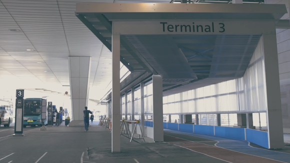
Narita Airport is the Tokyo area’s largest access point for air travelers. This month, the terminal added a new terminal specifically designed for low-cost carriers and budget travelers, but as this sneak peak video shows, affordable can overlap with innovative and stylish, as Terminal 3 is set to prove that you don’t have to spend big to help people travel in ease and comfort.
The new terminal opened on April 8, with the goal of better serving the changing needs of those flying to and from eastern Japan. According to Narita management, in 2014 low-cost carriers made up 19.3 percent of flights at the airport, a rapid increase from just 6.1 percent in 2012.
However, in constructing a building just for such flights, there are obviously budgetary concerns to take into consideration, and the goal was to build Terminal 3 for half the cost a facility of such size would ordinarily entail. Not only has the team succeeded, as the video below shows being inexpensive doesn’t have to feel cheap.
Primary construction was handled by Nikken Sekkei, the same architecture firm responsible for the Tokyo Skytree. Seeking to keep things as simple and functional as possible, the designers were faced with a tricky challenge.
The tight budget meant that moving walkways, which are often employed to help travelers quickly move about airports, weren’t going to be an option. On the other hand, tramping around on hard concrete or tile flooring can quickly tire out your feet, ankles, and knees, especially if you’re lugging a heavy suitcase with you. So what did Nikken Sekkei decide to do?
Install surfaces made out of the same shock-absorbing material as running tracks.
Different sections of the flooring even have different colors, serving as paths to the departure and arrival area. Those who’re about to start their journey by soaring off into the blue sky should follow the similarly colored blue track. On the other hand, if you’ve just landed, the earthy red paths will lead you to the arrival area. As an added bonus, this also reduces the need for costly electronic displays to guide travelers around the building.
▼ Large cloth banners also cut down on the need for electronic signage
Nikken Sekkei wasn’t alone in thinking up solutions like these, though. Also working on the project were digital creative firm PARTY and Ryohin Keikaku, a division of interior goods manufacturer Mujirushi Ryohin, also known internationally as Muji. Utilizing the company’s experience in simple yet comfortable design, Ryohin Keikaku was responsible for supplying tables and chairs for Terminal 3’s food court, as well as sofas for the rest of the terminal.
Ryohin Keikaku put an extra amount of effort into the sofas. Whereas many airports specifically design their furniture to prevent lengthy lounging, Ryohin Keikaku realized that budget travelers don’t have the option of heading off to relax at a VIP club room before departure. As such, Terminal 3’s sofas were specifically designed to allow travelers to stretch out on them, and Ryohin Keikaku even used Mujirushi Ryohin’s mattresses as a comfort benchmark.
“We had to think about how to change the negative connotations of ‘low-cost,’” explains Nikken Sekkei’s Takao Goto, “about how to change that into a fun, positive image.” From the preview video, Terminal 3 may not have all the luxurious amenities of some more opulent airport facilities, but it definitely looks like a hassle-free way to start your trip, plus a smooth, easy way to transition back to daily life once it’s time to come home.
Sources: Kai-You, Vimeo, Narita Airport
Images: Vimeo