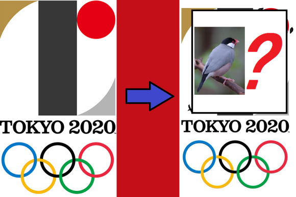
It’s been a rocky debut for the 2020 Tokyo Olympics official logo. First, it elicited mixed reactions as to whether its somewhat obtuse aesthetics really conveyed the noble sentiments it was aiming for. Then came the allegations that the logo was plagiarized from the emblem of a Belgian theater.
But let’s set aside the issue of whether or not the design is a copy or not and ask another artistic question: Is the Tokyo Olympics logo actually an adorably stylized bird?
To review, the Tokyo Olympic Organising Committee describes the logo as an abstract capital T. The central line is black, the color produced by mixing all others together, to symbolize the diversity of the event’s participants. Patches of gold and silver seem to be obvious references to the Olympic medals given to first and second-place finishers, while the red circle is borrowed from the flag of Japan, where it represents the sun.
Japanese Twitter user MYM, though, perceives something else entirely, and made a few additions to the logo to better illustrate what he sees.
“I can’t see it as anything other than a Java sparrow anymore,” he tweets, and he’s got a point. Sort of like those who say the Batman logo looks like tonsils and teeth, if you take the different colors as occupying separate planes in a 3-D perspective, suddenly you’ve got a feathery friend staring down at you from his perch.
Of course, given how much Japan loves cute animals and mascot characters, maybe this isn’t such a bad turn of events for the Tokyo Olympics. They may as well run with it and get to work producing official merchandise, especially since they can sell two of everything if they also make a version for the black bird inside the Paralympics logo.
Source: Twitter/@yuuzakura
Top image: Tokyo Organising Committee of the Olympic and Paralympic Games, Twitter/@yuuzakura, Wikipedia/Quadell (edited by RocketNews24)
Insert images: Tokyo Organising Committee of the Olympic and Paralympic Games, Twitter/@yuuzakura (edited by RocketNews24)