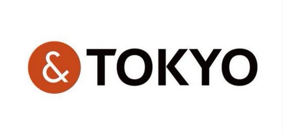
Tokyo Governor Yoichi Masuzoe revealed the capital city’s new logo at a press conference in the nation’s capital on Friday, and the simple design, featuring the one-line catchphrase “&TOKYO”, is already in the spotlight for all the wrong reasons.
The logo unveiling was met with a heightened level of scrutiny following the plagiarism scandal which resulted in the withdrawal of the official Tokyo 2020 Olympics logo recently, and it turns out that netizens are now worried about a recurrence of events. The distinctive white ampersand enclosed in a circle has been discovered online in a similar black, white and red configuration currently in use by another organisation, an insurance and commercial litigation company in New Zealand.
The new logo for Tokyo city was designed by ad agency Hakuhodo, under the guidance of Hakuhodo Design CEO Kazufumi Nagai, son of well-known graphic designer Kazumasa Nagai, at a cost of approximately 130 million yen (US$1.09 million). The logo is part of the Governor’s efforts to promote the nation’s capital overseas, with a number of additions to the “&TOKYO” phrase working to emphasise highlights of the city for visitors.
Netizens are concerned it might now be a case of “PLAGIARISM&TOKYO”, however, following the discovery of a similar-looking logo abroad, which, as luck would have it, is being used by a company of lawyers.
▼ To compound the problem, the distinctive ampersand is being used in a similar way by both organisations on their websites.
▼ The “&TOKYO” website features a variety of different colours, but the “&” mark still looks awfully similar.
Surprisingly, this isn’t the first time the Tokyo logo has come under scrutiny, with French eyewear brand Plug&See using a similar red and white ampersand design. However, they have expressed full support, citing “the Japanese-French friendship”, for Tokyo to keep its design.
There’s been no word yet on a response from Jones & Co and at the moment it’s not known whether the company has any knowledge of the Tokyo logo. We’ll have to wait to see if New Zealand will follow suit with a similar peace branch, although admittedly, the law company logo does look markedly more similar than the one from Plug&See. Who knew a simple conjunction could cause such strife?
For a sneak peek at the campaign before official marketing begins on October 16, check out the three promotional videos below. Be sure to keep an eye out for a cameo from “Beat” Takeshi Kitano as a Japanese fishmonger and an appearance by artist Yayoi Kusama!
What do you think, Rocketeers? Are the people of Japan right to be concerned, or is everyone just on edge following the whole Tokyo Olympics logo debacle? After all, it’s just an ampersand in a circle…right?
Source: My Game News Flash
Top Image: &TOKYO
Insert Images: &TOKYO, Jones&Co, Plug&See, YouTube/TOKYOBRAND