

When I first started learning Japanese, the Chinese characters and syllabic scripts that were scrawled across my textbooks looked like some kind of crazy code that only aliens could understand. After years of studying, many of the previously cryptic symbols have become familiar, readable letters. However, now even English can be turned into a jumble of alien ciphers thanks to these 10 +1 fonts inspired by Japanese characters.
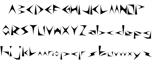
1. TokyoSoft
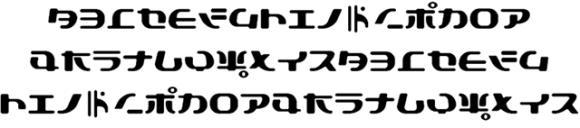

This font is modeled after katakana, one of the Japanese syllabic alphabets, and is the font we used above. This is probably the most confusing font for Japanese people to read because actual Japanese characters represent most of the roman letters.![]()

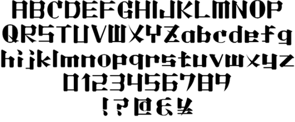
2. Kaneiwa

Japanese Ming-style typeface was the inspiration for this font.
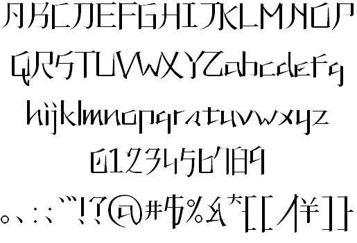
3. Lightmorning

This one was also inspired by Ming-style typeface, but it’s a little easier for English-speakers to decipher. The serifs (lines extending and trailing off of the letters), a major characteristic of Ming-style writing, are very exaggerated.
4. Pray for Japan
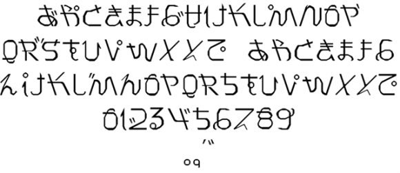

This font closely resembles hiragana, one of the two Japanese syllabries.
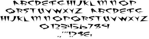
5. Digital Ninja

With pointed edges and an “x” that looks like a shuriken ninja star, this unique font was created with ninjas in mind.
6. GoJuOn
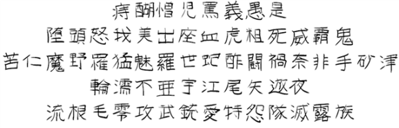

GoJuOn means “50 sounds” that represent the Japanese syllabary. It’s unclear why the creator of this font chose the kanji used in GoJuOn, but there are many creepy kanji. For example, the kanji for “blood,” “ferocious,” and “pain” are used to represent English letters.
7. Akihibara hyper
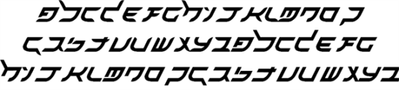

The title is misspelled, but Akihabara, the nerd capital of Japan, was the inspiration for this font. It looks more like the Hebrew alphabet than Japanese characters.
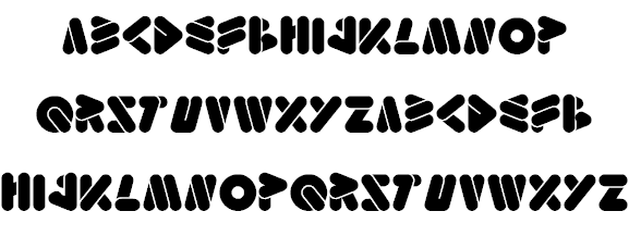
8. Origami

This font contains folded lines, much like the shapes of folded paper origami creations.
9. Emperor of Japan

This font has a cute and friendly style… Is the Emperor of Japan cute and friendly?
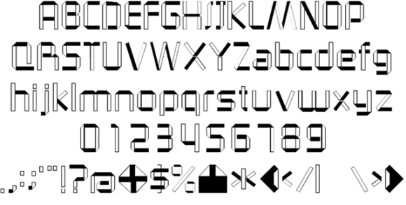
10. Fat Sushi

With a name like “Fat Sushi,” you’d expect pudgy, bold letters, but this font has a powerful, sharp design.
+1 Kinishinai
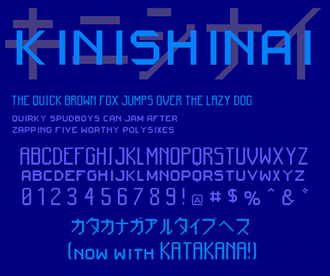

This font isn’t quite Japanese-style, but the title is great. “Kinishinai” means “don’t worry about it” in Japanese. There were tons of strange fonts in this post, but “don’t worry about it”, you can download them all for free off of the WebCreatorBox website (Japanese only).
Source: WebCreatorBox
*Welcome to RocketNews! Bringing you yesterday’s news from Japan and Asia, today.