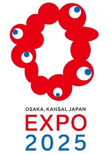
Believe it or not, the design is inspired by cherry blossoms.
As you can probably guess from the name, we’re still a few years out from World Expo 2025, alternately called Expo 2025 Osaka, Kansai, Japan. Putting together a world’s fair is a big project, though, and so the planners of the event, to be held in Osaka City’s Yumeshima district, are getting an early start.
For example, they’ve already decided on an official logo, which was unveiled this week. This being Japan, you might expect the logo to be some mix of stylishness and cuteness, both important aspects of Japanese graphic design. Instead, though, it’s a mix of horror and confusion.
The official logo is an uneven ring made up of globular blood-red masses fused together and five eyeballs, all looking in different directions. While you might assume this is the result of the Expo 2025 organizers getting stuck after hiring a designer who turned out to have a much more unusual sense of aesthetics than they’d originally bargained for, that’s not the case at all. Instead, the unusual logo was selected by organizers from a pool of 5,984 submissions from various artists collected between November and December of last year. So yes, they turned down nearly 6,000 alternatives in order to go with this.
▼ Out of the five finalists, only one looks life something you’d find sealed in a box hidden in the attic of a house where all the previous occupants went crazy.
Online reactions have included:
“Why was THIS what they decided to go with?”
“That’s some straight-up horror stuff right there.”
“All I’m seeing is intestines.”
“I hope people like it…but I don’t see that happening.”
“…ll me…kill me…”
Some were reminded of unsettling anime/manga designs such as those found in Made in Abyss and Parasyte…
…while others felt the logo looked better suited to challenging space pilots as the level boss of a bio-menace shooter video game, such as R-Type or Life Force, than welcoming families to a world’s fair.
There’s already fan art too, some showing the creature encased in a jar or mad-scientist chamber, since it doesn’t entirely look like something that’s capable of surviving in the normal human environment.
▼ “Please enjoy the world’s fair.”
Even the logo’s designer, 55-year-old artist and Osaka native Tamotsu Shimada, didn’t expect his submission to beat out its thousands of rivals. “I am truly surprised it was selected. I never thought it would become the face of the expo,” he said at the announcement ceremony, “but I couldn’t’ be happier.”
So why does the logo look the way it does? Shimada says it’s meant to express “the bright light of life,” and so he wanted it to look like a series of interconnected cells. The reason it isn’t a perfectly circular ring is because the empty space in the middle is supposed to match up with the shape of Osaka and the surrounding Kansai region of Japan. And as for those eyes? Tamada says they’re an homage that “expresses the DNA of the 1970 Osaka Expo,” which had a stylized five-petal cherry blossom as its official logo.
▼ Cherry blossoms and eyeballs are pretty much equally attractive in all situations, right? (Caution: do NOT imagine a sakura tree covered in eyeballs that gently flitter to the ground when the wind blows).
As unsettling as the logo is at first glance, though, it’s not without supporters. While kawaii, the Japanese word for “cute,” has been seeping into the English vernacular in recent years, there’s also the word kimokawaii, “creepy cute,” which seems to be the sentiment behind some of the more affectionate fan art for Inochi no Kagayaki-kun (“Bright Life of Light-kun”), as the logo life form has been unofficially nicknamed.
▼ Inochi no Kagayaki-kun: “So this is a human education facility…”
Schoolgirl who knows about the alien’s existence: “Shhh! You promised to keep quiet!”
▼ Inochi no Kagayaki-kun getting its cheek (?) pinched
Some even argued that a mascot with an irregular physical form that challenges the mind’s ability to comprehend it is an Osaka world’s fair tradition, and that Inochi no Kagayaki-kun is a fitting successor to the legacy of the Tower of the Sun which was constructed for the 1970 event.
The logo is also keeping with the commitment to unique aesthetics of the super-gaudy “Osaka fist” public art installation from when Osaka was still trying to capture the selection as the host city for Expo 2025. Plus it’s got the wholehearted support of the planning committee’s secretary-general Hiroyuki Ishige, who said:
“The logo is an asymmetrical design, which incorporates Osaka’s spirit of fun, and it feels strange in a good way…Moving past the confines of logos, and moving past the confines of the coronavirus, I hope it will open up a path to a new world.”
Because hey, when you have a logo that at least half of people seem to find terrifying, bringing up the worst plague in generations is the easiest way to make it seem less scary by comparison.
Sources: Nihon Keizai Shimbun via Hachima Kiko, Jin
Top image: Twitter/@meti_NIPPON
Insert image: Wikipedia/時の探検者
● Want to hear about SoraNews24’s latest articles as soon as they’re published? Follow us on Facebook and Twitter!