
Believe it or not, the design is inspired by cherry blossoms.
As you can probably guess from the name, we’re still a few years out from World Expo 2025, alternately called Expo 2025 Osaka, Kansai, Japan. Putting together a world’s fair is a big project, though, and so the planners of the event, to be held in Osaka City’s Yumeshima district, are getting an early start.
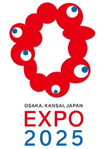
For example, they’ve already decided on an official logo, which was unveiled this week. This being Japan, you might expect the logo to be some mix of stylishness and cuteness, both important aspects of Japanese graphic design. Instead, though, it’s a mix of horror and confusion.
【大阪・関西万博ロゴマーク 決定!】
— 経済産業省 (@meti_NIPPON) August 25, 2020
皆様からお寄せいただいた5,894作品の中から、2025年大阪・関西万博のシンボルとなるロゴマークが決定しました。世界中から愛されるシンボルとなりますように😊 pic.twitter.com/PqoJKP2VLT
The official logo is an uneven ring made up of globular blood-red masses fused together and five eyeballs, all looking in different directions. While you might assume this is the result of the Expo 2025 organizers getting stuck after hiring a designer who turned out to have a much more unusual sense of aesthetics than they’d originally bargained for, that’s not the case at all. Instead, the unusual logo was selected by organizers from a pool of 5,984 submissions from various artists collected between November and December of last year. So yes, they turned down nearly 6,000 alternatives in order to go with this.
▼ Out of the five finalists, only one looks life something you’d find sealed in a box hidden in the attic of a house where all the previous occupants went crazy.
https://twitter.com/___KiTi___/status/1298184363197095936Online reactions have included:
“Why was THIS what they decided to go with?”
“That’s some straight-up horror stuff right there.”
“All I’m seeing is intestines.”
“I hope people like it…but I don’t see that happening.”
“…ll me…kill me…”
Some were reminded of unsettling anime/manga designs such as those found in Made in Abyss and Parasyte…
— うる@動画投稿用 (@KemomiMofumofu) August 25, 2020
— スト🌈UNDERGROUND (@LARCxEKOGU) August 25, 2020
…while others felt the logo looked better suited to challenging space pilots as the level boss of a bio-menace shooter video game, such as R-Type or Life Force, than welcoming families to a world’s fair.
良いと思います pic.twitter.com/bQKE8nH16x
— みにみ (@32mi) August 25, 2020
ここで名作「沙羅曼蛇」と比較してみましょう#大阪万博 #EXPO2025 https://t.co/alMCLbzL3S pic.twitter.com/Qz3QiuSlyr
— 🐦かなりやくみちょー®︎🐦 りのべやさん。 (@kanariyakumicho) August 25, 2020
There’s already fan art too, some showing the creature encased in a jar or mad-scientist chamber, since it doesn’t entirely look like something that’s capable of surviving in the normal human environment.
かわいい pic.twitter.com/nveyKWjyL1
— おぷーナ (@op_na_ura) August 25, 2020
▼ “Please enjoy the world’s fair.”
— 管狐 (@kuda_tmg) August 25, 2020https://twitter.com/cy_aisu/status/1298155871109697539
Even the logo’s designer, 55-year-old artist and Osaka native Tamotsu Shimada, didn’t expect his submission to beat out its thousands of rivals. “I am truly surprised it was selected. I never thought it would become the face of the expo,” he said at the announcement ceremony, “but I couldn’t’ be happier.”
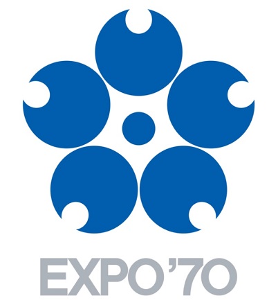
So why does the logo look the way it does? Shimada says it’s meant to express “the bright light of life,” and so he wanted it to look like a series of interconnected cells. The reason it isn’t a perfectly circular ring is because the empty space in the middle is supposed to match up with the shape of Osaka and the surrounding Kansai region of Japan. And as for those eyes? Tamada says they’re an homage that “expresses the DNA of the 1970 Osaka Expo,” which had a stylized five-petal cherry blossom as its official logo.
▼ Cherry blossoms and eyeballs are pretty much equally attractive in all situations, right? (Caution: do NOT imagine a sakura tree covered in eyeballs that gently flitter to the ground when the wind blows).
As unsettling as the logo is at first glance, though, it’s not without supporters. While kawaii, the Japanese word for “cute,” has been seeping into the English vernacular in recent years, there’s also the word kimokawaii, “creepy cute,” which seems to be the sentiment behind some of the more affectionate fan art for Inochi no Kagayaki-kun (“Bright Life of Light-kun”), as the logo life form has been unofficially nicknamed.
https://twitter.com/sleeper_is_mine/status/1298169882668752897▼ Inochi no Kagayaki-kun: “So this is a human education facility…”
Schoolgirl who knows about the alien’s existence: “Shhh! You promised to keep quiet!”
▼ Inochi no Kagayaki-kun getting its cheek (?) pinched
https://t.co/zIKwvBYVR6 pic.twitter.com/UJUBHmbIal
— 田村部 尊☀ (@tamurabeson) August 25, 2020
Some even argued that a mascot with an irregular physical form that challenges the mind’s ability to comprehend it is an Osaka world’s fair tradition, and that Inochi no Kagayaki-kun is a fitting successor to the legacy of the Tower of the Sun which was constructed for the 1970 event.
"大阪万博"はそうでなくちゃね
— 馬 (@u_m_a_z_u_r_a) August 25, 2020
枠に収まった無難なのは面白くない pic.twitter.com/vx6KnOvFZZ
The logo is also keeping with the commitment to unique aesthetics of the super-gaudy “Osaka fist” public art installation from when Osaka was still trying to capture the selection as the host city for Expo 2025. Plus it’s got the wholehearted support of the planning committee’s secretary-general Hiroyuki Ishige, who said:
“The logo is an asymmetrical design, which incorporates Osaka’s spirit of fun, and it feels strange in a good way…Moving past the confines of logos, and moving past the confines of the coronavirus, I hope it will open up a path to a new world.”
Because hey, when you have a logo that at least half of people seem to find terrifying, bringing up the worst plague in generations is the easiest way to make it seem less scary by comparison.
Sources: Nihon Keizai Shimbun via Hachima Kiko, Jin
Top image: Twitter/@meti_NIPPON
Insert image: Wikipedia/時の探検者
● Want to hear about SoraNews24’s latest articles as soon as they’re published? Follow us on Facebook and Twitter!
 Osaka Expo nightmare-fuel mascot needs name, organisers ask for suggestions and Twitter delivers
 Osaka makes decision on terrifying mascot for upcoming world’s fair
 Which of these three terrifying characters do you want as the mascot of Osaka’s World Expo?
 Czech Republic makes multi-eyed mascot friend for Osaka’s multi-eyed Myaku-Myaku mascot
 Osaka World Expo “Fist” statue stirs controversy for being “incredibly gaudy”
 Tokyo subway installing new ticket gates that don’t accept payment through Suica or other IC cards
 Japanese Shinkansen becomes an overnight hotel for three nights this summer
 New Shinkansen luggage drop-off system begins in Japan, making train travel even easier
 Giant Evangelion Spear of Longinus to be installed at Japanese train station with Eva art trains
 99-year-old woman rescued while attempting to climb Mt. Fuji
 Starbucks Japan releases a miniature display rack so you can create your very own store at home
 Which country’s foreign tourists spend the most money per-person in Japan? Hint: Not the U..S. or China
 Eight great words for talking about summer in Japan in Japanese
 Japanese Coo-Che becomes a viral sensation, and everyone wants a taste
 Japan now has human refrigerators inspired by Japanese vending machines
 Hatsune Miku collaborates with Hokusai’s art in new Vocaloid ukiyo-e illustration series [Pics]
 Studio Ghibli releases anime T-shirts that pay homage to one of Hayao Miyazaki’s most personal films
 Japanese convenience store releases Japanese convenience store-flavor fried chicken
 Family Mart’s new Tokyo flagship convenience store doesn’t feel convenient, but is that a problem?
 Starbucks Japan releases new Discovery Series collection celebrating local regions and traditions
 Studio Ghibli has a new anime out, and there’s only one place in the world where you can see it
 Salomon releases Japan-exclusive Mt. Fuji hiking gear that doubles as an amazing souvenir
 Japan triples departure tax, foreign tourists and locals now must pay more to leave country
 Family Mart opens new “Famima” flagship store in Tokyo that’s like a tourist attraction
 Sanrio Character Poll announces winners, Hello Kitty absent from top 10 in many countries
 Japan announces sudden 400-percent increase in visa fees for foreigners entering the country
 Japan’s human washing machines will go on sale to general public, demos to be held in Tokyo
 Starbucks Japan releases new drinkware and goods for Valentine’s Day
 Starbucks Japan releases new sakura goods and drinkware for cherry blossom season 2026
 Japan’s newest Shinkansen has no seats…or passengers [Video]
 Japanese ninja certification exam attracts 131 candidates from Japan and abroad
 Put sesame oil in your coffee? Japanese maker says it’s the best way to start your day【Taste test】
 Japan reportedly adding Japanese language skill requirement to most common foreigner work visa
 Osaka Expo mascot popularity ranking held and Myaku-Myaku did not win
 Osaka’s creepy cute mascot speaks for first time, adds more fuel the creepy OR cute debate【Video】
 Japan’s newest life-size Gundam is finished, receives Shinto blessing in Osaka【Video】
 Osaka Expo 1,000-yen coins go on sale for the low price of 13,800 yen
 Osaka governor calls president of Earth to deal with swarms of Expo bugs
 The pavilions and public restrooms of the 2025 Osaka-Kansai World Expo
 Fatal flop or fun? What is the 2025 World Expo in Osaka really like?
 World’s most terrifyingly scary-looking alpaca found in Japan【Photos】
 Japanese comedy giant Yoshimoto holds surprisingly existential pavilion at 2025 Expo
 U.K. Pavilion at Japan World Expo responds to complaints about shabby afternoon tea quality【Videos】
 Pikachu, Hello Kitty Elected 2025 Expo Ambassadors to Osaka
 Terrifying Pokémon fan art fails to win card design contest, succeeds at scaring everyone【Photos】
 Expo 2025 mascot Myaku-Myaku to release tastefully erotic photo book
 Osaka restaurateur sends ramen ingredients into space for six months to test effects of cosmic rays
 Japan prepares itself for…THE FUTURE!!! Lots of bridges and living underwater expected