Although in the cars’ defense I never really knew what that logo was supposed to be either.
The continuing automation of cars is sure to pose a number of societal changes that we may not even be able to begin to imagine. Aside from the obvious changes to the way we get around and transport goods, the increasing intelligence means we will have to communicate with these machines more and more.
Vehicular misunderstandings aren’t a new problems, decades-old educational works such as Knight Rider and Maximum Overdrive have each highlighted how communication between human and car can go terribly right and terribly wrong respectively.
Even in the real world, signs of miscommunications are already beginning to emerge. Motorist and Twitter user Yukiesu (@yuk381) posted a scene from his driver seat in front of a Tenkaippin ramen store. In it, despite just sitting in the parking lot, a warning on his dashboard is indicating that the car sees a “Do Not Enter” sign.
▼ You can see the car misinterpreting the sign
with the little red circle in the bottom right.
As Yukiesu points out, this appears to be a feature of Honda cars. Past encounters also confirm that cars equipped with Honda SENSING tend to be the ones that react to the ramen chain’s signage.
▼ Another misinterpretation, this time
shown in the bottom center of the photo.
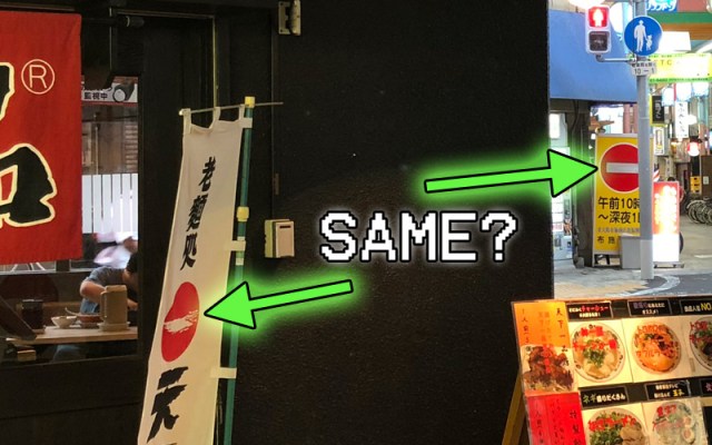
It’s something that only a few people noticed before, but when looking at them side-by-side, the Tenkaippin logo and a Do Not Enter symbol are awfully similar.
▼ A “Do Not Enter” sign…
▼ …and a “Tenkaippin” sign. Hmm, wait a minute….
I also never really thought about it before, but what is that logo supposed to be anyway? I just assumed that it was a little cloud floating past the iconic rising sun as seen on Japan’s national flag. Given that then name Tenkaippin loosely translates to “The best stuff south of heaven,” it’s kind of a fitting visual.
The internet has other theories too. Another obvious possibility is that the white line represents the kanji character for “one” again referring to the use of “number one” or “best” in the name. That being said, the stroke is a little wonky for a “one.”
Then there’s a whole school of thought that the logo was always intended to be a “Do Not Enter” sign. Although that might seem counterintuitive for a business, the prevailing theory is that Tenkaippin has a unique taste that they do not compromise for picky eaters. So if you don’t like it, just read the sign pal.
There’s also the suggestion that the sign is referring to the soup itself, meaning that it’s perfect the way it is so you shouldn’t put anything else in there. In other words, its a message for additional seasonings: Do Not Enter.
▼ Food only goes out of this bowl, not in.
Whatever the case may be, it is certainly turning off cars. It’s a warning that when designing ads and signs that go out in the public we should be considerate of our simple-sighted two-ton friends as well, so as not to throw them off their game.
On the other hand, with the rising trend of cars slamming into storefronts in Japan, Tenkaippin may be onto something, as I’ve never heard of a car crashing into one of their locations. Perhaps 7-Eleven should adopt a more stop-sign like logo for their own safety.
Source: Twitter/@yuk381, Hachima Kiko, Naver Matome
Images: SoraNews24