
Although in the cars’ defense I never really knew what that logo was supposed to be either.
The continuing automation of cars is sure to pose a number of societal changes that we may not even be able to begin to imagine. Aside from the obvious changes to the way we get around and transport goods, the increasing intelligence means we will have to communicate with these machines more and more.
Vehicular misunderstandings aren’t a new problems, decades-old educational works such as Knight Rider and Maximum Overdrive have each highlighted how communication between human and car can go terribly right and terribly wrong respectively.
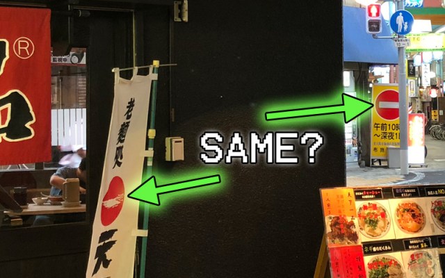
Even in the real world, signs of miscommunications are already beginning to emerge. Motorist and Twitter user Yukiesu (@yuk381) posted a scene from his driver seat in front of a Tenkaippin ramen store. In it, despite just sitting in the parking lot, a warning on his dashboard is indicating that the car sees a “Do Not Enter” sign.
▼ You can see the car misinterpreting the sign
with the little red circle in the bottom right.
ホンダの人工知能が「天下一品」の看板と「進入禁止」の標識を見分けられないので、車種によっては天下一品に近づくだけで人間に進入禁止の警告を出してしまう件、嘘だろと思ってたら本当に進入禁止になって笑った pic.twitter.com/3Qk1UVIxox
— ゆきえす🐎 (@yuk381) September 12, 2018
As Yukiesu points out, this appears to be a feature of Honda cars. Past encounters also confirm that cars equipped with Honda SENSING tend to be the ones that react to the ramen chain’s signage.
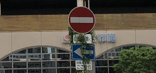
▼ Another misinterpretation, this time
shown in the bottom center of the photo.
N-BOXのHonda SENSING、標識認識機能で⛔(車両進入禁止)も検知するけど、これに気付いたときはホンマに爆笑したwww初っぱなから良き思い出😆 pic.twitter.com/NwB5NUpJhX
— Run@GP4🌿 (@BleuVvvRunner) December 4, 2017
It’s something that only a few people noticed before, but when looking at them side-by-side, the Tenkaippin logo and a Do Not Enter symbol are awfully similar.
▼ A “Do Not Enter” sign…
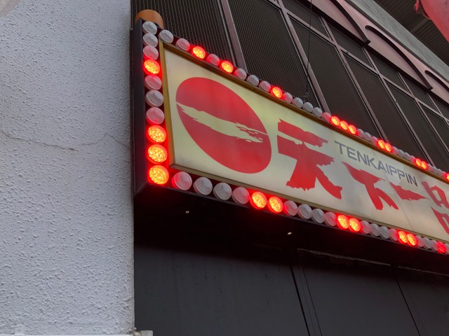
▼ …and a “Tenkaippin” sign. Hmm, wait a minute….
I also never really thought about it before, but what is that logo supposed to be anyway? I just assumed that it was a little cloud floating past the iconic rising sun as seen on Japan’s national flag. Given that then name Tenkaippin loosely translates to “The best stuff south of heaven,” it’s kind of a fitting visual.
The internet has other theories too. Another obvious possibility is that the white line represents the kanji character for “one” again referring to the use of “number one” or “best” in the name. That being said, the stroke is a little wonky for a “one.”
Then there’s a whole school of thought that the logo was always intended to be a “Do Not Enter” sign. Although that might seem counterintuitive for a business, the prevailing theory is that Tenkaippin has a unique taste that they do not compromise for picky eaters. So if you don’t like it, just read the sign pal.
There’s also the suggestion that the sign is referring to the soup itself, meaning that it’s perfect the way it is so you shouldn’t put anything else in there. In other words, its a message for additional seasonings: Do Not Enter.
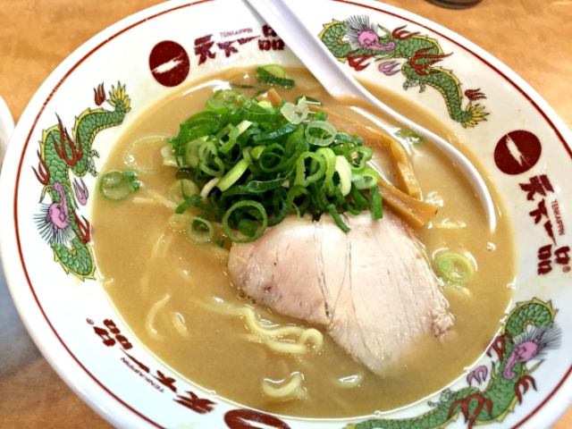
▼ Food only goes out of this bowl, not in.
Whatever the case may be, it is certainly turning off cars. It’s a warning that when designing ads and signs that go out in the public we should be considerate of our simple-sighted two-ton friends as well, so as not to throw them off their game.
On the other hand, with the rising trend of cars slamming into storefronts in Japan, Tenkaippin may be onto something, as I’ve never heard of a car crashing into one of their locations. Perhaps 7-Eleven should adopt a more stop-sign like logo for their own safety.
Source: Twitter/@yuk381, Hachima Kiko, Naver Matome
Images: SoraNews24
 Face lettuce appears in Japan, with the face of Death Note’s Light Yagami, but why?
 Studio Ghibli adds new Ponyo glassware to its anime lineup for summer
 Family Mart’s new Famima flagship in Tokyo has a hidden gem that most visitors miss
 Tokyo subway installing new ticket gates that don’t accept payment through Suica or other IC cards
 Japanese Coo-Che becomes a viral sensation, and everyone wants a taste
 Pokémon’s cozy city builder game inspires Cozy (Corner) cakes in Japan! [Photos]
 Giant Evangelion Spear of Longinus to be installed at Japanese train station with Eva art trains
 Japanese Shinkansen becomes an overnight hotel for three nights this summer
 Starbucks Japan releases a miniature display rack so you can create your very own store at home
 Universal Studios Japan requiring consent form for adults-only horror attraction
 New Shinkansen luggage drop-off system begins in Japan, making train travel even easier
 99-year-old woman rescued while attempting to climb Mt. Fuji
 Japanese convenience store releases Japanese convenience store-flavor fried chicken
 Which country’s foreign tourists spend the most money per-person in Japan? Hint: Not the U..S. or China
 Japan now has human refrigerators inspired by Japanese vending machines
 Studio Ghibli releases anime T-shirts that pay homage to one of Hayao Miyazaki’s most personal films
 Studio Ghibli has a new anime out, and there’s only one place in the world where you can see it
 Salomon releases Japan-exclusive Mt. Fuji hiking gear that doubles as an amazing souvenir
 Hatsune Miku collaborates with Hokusai’s art in new Vocaloid ukiyo-e illustration series [Pics]
 Japan triples departure tax, foreign tourists and locals now must pay more to leave country
 Family Mart opens new “Famima” flagship store in Tokyo that’s like a tourist attraction
 Sanrio Character Poll announces winners, Hello Kitty absent from top 10 in many countries
 Japan announces sudden 400-percent increase in visa fees for foreigners entering the country
 Japan’s human washing machines will go on sale to general public, demos to be held in Tokyo
 Starbucks Japan releases new drinkware and goods for Valentine’s Day
 Starbucks Japan releases new sakura goods and drinkware for cherry blossom season 2026
 Japan’s newest Shinkansen has no seats…or passengers [Video]
 Japanese ninja certification exam attracts 131 candidates from Japan and abroad
 Put sesame oil in your coffee? Japanese maker says it’s the best way to start your day【Taste test】
 Pokémon’s cozy city builder game inspires Cozy (Corner) cakes in Japan! [Photos]
 Giant Evangelion Spear of Longinus to be installed at Japanese train station with Eva art trains
 Japanese Shinkansen becomes an overnight hotel for three nights this summer
 Starbucks Japan releases a miniature display rack so you can create your very own store at home
 Universal Studios Japan requiring consent form for adults-only horror attraction
 Which country’s foreign tourists spend the most money per-person in Japan? Hint: Not the U..S. or China
 Why is Taco Bell failing in Japan, even as the country falls in love with tacos?
 How are you supposed to wash a Japanese futon duvet at the laundromat?
 Dance with demons in Kyoto at this Edo-period Japanese Halloween festival
 Starbucks Japan adds a new summer Frappuccino to the menu, but is it as refreshing as it looks?
 Studio Ghibli releases Japanese curry shirts in honour of anime about the studio’s staff
 Hatsune Miku collaborates with Hokusai’s art in new Vocaloid ukiyo-e illustration series [Pics]
 Foreign hiker on Mt. Fuji loses consciousness and dies, becoming climbing season’s second fatality