logos
Blue is Sega’s image color the world over, but fans in different parts of the world see different things.
Although in the cars’ defense I never really knew what that logo was supposed to be either.
Could this be the iconic mermaid’s ultimate form? Either way, these Starbucks parody t-shirts are worth checking out!
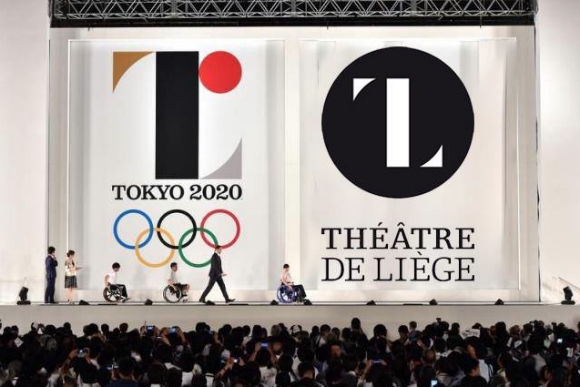
Last Friday the logo was revealed for Tokyo’s 2020 Olympic and Paralympic Games. It was received with mixed reviews, with many of the opinion that the aesthetic thought that went into the logo wasn’t quite as deep as the message behind it.
As if there wasn’t already enough debate about the execution of the logo design itself, now there are rumors that the design could possibly be a plagiarization of the work of French designer Oliver Debie.
Here at RocketNews24 we can’t resist a good Pokémon mashup, whether it’s official merchandise or fan-made goodies. Micah Coles is a fan who combined his love of Pokémon with a keen eye for design, reimagining NBA team logos with a new corresponding Pokémon! He’s made new Poké-mascot logos for each and every NBA team, plus a few extras, too!


 The average age of Japan’s hikikomori shut-ins is getting older, survey shows
 Studio Ghibli releases crystal glass paperweights featuring Totoro and the Catbus
 Samurai Coffee: Try Edo period coffee once enjoyed by Japanese warriors
 Japan’s new Pokémon jackets give you the look and powers of the Kanto starter trio
 Sega opening 65th anniversary store in downtotn Tokyo with deep-cut game merch
 Japan enters Golden Week vacation period, survey shows one in three plan to ride it out at home
 Viral tweet suggests Japanese convenience store ripping off customers with donuts, so we investigate
 Studio Ghibli releases new anime keychains that are like miniature figurines
 Retro-style Evangelion T-shirts coming to Uniqlo sister brand GU[Photos]
 Lipton releases… Pudding Milk Tea in Japan?!?
 Brand-new Square Enix Cafe to open in Tokyo…and in Los Angeles too!
 New Kyoto Converse sneakers celebrate Japan with traditional kimono fabrics for your feet
 Japan’s 5.3 million beautiful Hitachi Nemophila flowers are now in full bloom[Photos]
 Hello Kitty is now a transforming truck robot[Photos]
 Dorayaki from 89-year-old Japanese confectionery shop is one of the best sweets hidden in Tokyo
 What are the worst things about living in the Japanese countryside?[Survey]
 Tifa’s Final Fantasy VII bar is going to pop up in real-world Tokyo
 Japan reportedly adding Japanese language skill requirement to most common foreigner work visa
 Wisteria season starts early with blooming of Japan’s Great Wisteria in its beautiful garden
 Pokémon and Ikea Japan cross over into each other’s worlds with collaboration events
 Japan’s best conveyor belt sushi restaurant of seven years ago has now, finally, come to Tokyo
 Brand-new Pokémon manhole covers coming to help the recovery of a disaster-stricken part of Japan
 Japan’s awesomely beautiful Alpen Route snow corridor is now open
 Injuries on stairs in Tokyo highlight an overlooked design flaw
 Survey asks foreign tourists what bothered them in Japan, more than half gave same answer
 Japan’s human washing machines will go on sale to general public, demos to be held in Tokyo
 Starbucks Japan releases new drinkware and goods for Valentine’s Day
 We deeply regret going into this tunnel on our walk in the mountains of Japan
 Starbucks Japan releases new sakura goods and drinkware for cherry blossom season 2026
 Japan’s newest Shinkansen has no seats…or passengers [Video]
 Major Japanese hotel chain says reservations via overseas booking sites may not be valid
 Put sesame oil in your coffee? Japanese maker says it’s the best way to start your day【Taste test】
 No more using real katana for tourism activities, Japan’s National Police Agency says
 Japan enters Golden Week vacation period, survey shows one in three plan to ride it out at home
 Viral tweet suggests Japanese convenience store ripping off customers with donuts, so we investigate
 Studio Ghibli releases new anime keychains that are like miniature figurines
 Retro-style Evangelion T-shirts coming to Uniqlo sister brand GU[Photos]
 Lipton releases… Pudding Milk Tea in Japan?!?
 Dorayaki from 89-year-old Japanese confectionery shop is one of the best sweets hidden in Tokyo
 New Kyoto Converse sneakers celebrate Japan with traditional kimono fabrics for your feet
 Japan’s Mister Donut Japan tries its hand at Taiwanese-style street food donuts
 Live-action Ghibli Princess Mononoke stage play tickets are now on sale
 49-year-old Japanese shut-in spends weeks living with corpse of mother who died at home
 Tifa’s Final Fantasy VII bar is going to pop up in real-world Tokyo
 Bandai cancels gacha/blind-buy system for anime cosmetics, will let fans choose what they buy
 Shinto shrine will bless your bike helmet and give you a sacred bike helmet stamp
 Studio Ghibli releases new My Neighbor Totoro Plate for 2026