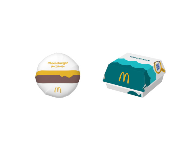
New designs look way more enticing than the previous ones.
In a country where presentation is everything, even fast food packaging is something that needs reassessing every now and then. Thats what’s been happening at McDonald’s in Japan recently, where they’ve just unveiled changes to a whopping 70 different types of packaging, bringing a brand new look to a slew of familiar menu items for the first time in six years.
The redesign utilises a “pop and colourful” colour scheme that aims to provide customers with “a greater sense of deliciousness and excitement about the meal“. The new Big Mac box, for example, features an illustration of a cross-section of a burger showcasing its sesame seeds, beef patty and lettuce.
The new-look Big Mac packaging is a huge improvement to the old one that’s currently being used, which looks bland in comparison with its simple “Big Mac” wording in red and brown hues.
The Filet-O-Fish box also has a fun new design that resembles the waves of the ocean where the fish is caught.
It’s another improvement on the old design, which simply has the words “Filet-O-Fish” printed across it.
The new Cheeseburger design looks a lot more simple than before, with an image that kind of resembles a sunset in the mountains but is actually a cheese-slathered beef patty.
Other changes include new cup designs…
▼ …new French fry packs…
▼…and a new-look McFlurry cup.
▼ The Apple Pie packs will be getting a redesign as well.
The takeout/delivery bags will also be getting a new design, going from this…
▼ …to this.
▼ The medium-sized bag above will be joined by a new large…
▼ …and a new small.
The image below shows McDonald’s packaging throughout the years, starting with the original design on the left –used in the U.S from 1955-1961, during the chain’s early period — through to the designs used in Japan from the ’90s to the 2010s, and the current day.
▼ The new range of designs coming to stores around Japan this year.
The new designs will appear gradually from mid-October, as stores restock their packaging when current stocks are depleted. While we love the look of the new designs, we can’t help but wish they would bring back the special packaging produced for the 100th anniversary in 2021 featuring Speedee, the original McDonald’s mascot.
Source, images: Press release
● Want to hear about SoraNews24’s latest articles as soon as they’re published? Follow us on Facebook and Twitter!