In recent years along with many other developing Asian nations, China has been increasing its level of industrial manufacturing as it readies itself for remarkable industrial growth. However, neglecting its environment for the sake of industry has brought with it the problem of dense smog pollution, with microscopic smog particles with a diameter of 2.5 micrometres or less having been detected in overwhelming large amounts in China’s air in recent days.
The smog is the same as that found in factory exhausts, car fumes and the like. Measured per cubic meter, at one instance the observed value of pollution in Beijing reached levels 10 times the Chinese government’s recommended safety level. If one were to go by the Wealth Health Organization (WHO)’s recommended value, the figure rises to 40 times greater than normal. When it comes to pollution, it is thought that of the asian nations undergoing remarkable growth, 70% of nations are reaching a critical level. The toxic substances that seep out into the environment cause asthma, pneumonia and even in some cases death.
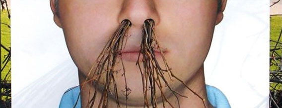
Of course, those living in highly polluted areas will surely want to know how their air compares, but measuring the levels each time can prove tiresome and expensive. With this in mind, one innovative company called Clean Air Asia has stumbled upon a way determine just how polluted your air is, and has designed an interactive map based on – wait for it – nostil hair.
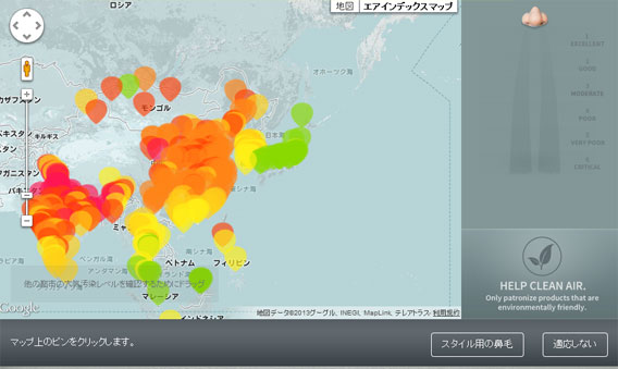
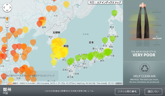
The method relies on the principle that the length of the nasal hair is directly related to the level of air pollution. Colour-coded and integrated into Google Maps, nostril hair length is made available to those concerned about the cleanliness of the air they breathe. By judging the average nostril hair length in any particular area, users can find out just how hazardous their environment is.
When you find an area on the map that you’re interested in, with a simple click, a nose icon appears on the right hand side of the screen. Depending on the level of pollution, the nasal hair length changes accordingly.
What do the different colors on the map mean?
If the colour is green, it means that you’re living in a clean area with no need for concern. Yellow means that the air around you is safe. When it comes to orange and red, the story is a little different: orange indicates the need for vigilance, while red, as I’m sure you have guessed by now, is the hazardous zone. I’m not quite sure just how fatal breathing in the air from the red zone would actually be, but it’s not something I’d like to try for experiment’s sake.
According to the World Health Organization (WHO), on a global scale, over 13 million people have died from air pollution-related illnesses; 8 Million of which being based in Asia.
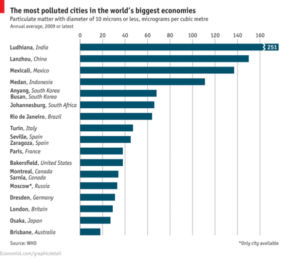
Britain’s The Economist has made use of WHO’s findings on world air pollution by creating a worldwide “worst ten” polluted city ranking. Taking a peek below, India takes the lead, followed in second place by China, and then Mexico. To our readers out there, I urge to you to check out the graph below and let us know what you think about the idea that nostril hair length is related to air pollution. For those readers living in the worst 10, as bizarre a question as it is, do you feel that your nostril hair length has been affected? Feel free to leave a comment below.
Source: カラパイア
Inset images: カラパイア , The Economist


 Air quality in Beijing now so poor that sunrises are being broadcast on giant TV screens [UPDATED]
 What’s the deal with these new nose gadgets Chinese policemen are wearing?
 Family Mart unveils new Japanese bread that elevates convenience store food to mocchiri levels
 Japanese manhole lid raises eyebrows with fertility god symbol that looks like… well, you know
 Foreign man arrested for walking on Shinkansen tracks, claims he was on the run from yakuza
 Famous koi ponds overwhelmed with tourists throwing thousands of coins in them
 Häagen-Dazs releases new Green Tea sandwich in Japan for a limited time
 Huge life-size Eevee Eeveelution Pokémon plushies will steal hearts, conquer living rooms【Photos】
 Tokyo turns its phone booths into free Wi-Fi hotspots, and here’s how to use them
 Why is Yoshinoya called Yoshinoya?
 Expensive Japanese nail clippers: Are they worth it?
 Hachiji juppun mae – A Japanese phrase that even Japanese people can’t agree on the meaning of
 Pokémon and Ikea Japan cross over into each other’s worlds with collaboration events
 Japan reportedly adding Japanese language skill requirement to most common foreigner work visa
 Starbucks Japan closing only Shinkansen platform branch for popularity-triggered renovations
 Two food hacks take Japan’s convenience store fried chicken to amazing new sandwich heights
 You can assemble a well-balanced team of Pokémon, them eat them, thanks to Japanese cake chain
 Fading Tokyo – Searching for signs of the Showa era as local neighborhoods evolve[Photos]
 Pokémon lacquerware series expands for Year of the Horse with new handcrafted design[Video]
 Tokyo teahouse serves up a sakura matcha dessert you won’t find anywhere else
 Totoro Fund line of beautiful artwork and apparel lets you help the real-world Totoro Forest
 Japan now has a special desk for people who work at home with a pet cat[Photos]
 Famous Tokyo cherry blossom spot installs view-blocking screens to fight overcrowding[Video]
 Uniqlo announces new T-shirts for One Piece, Naruto and more for manga publisher’s 100th birthday
 Train station platform ramen store closes its doors on half a century of history in Tokyo
 Starbucks Japan releases new My Fruit³ Frappuccino at only 34 stores around the country
 Studio Ghibli releases Catbus pullback keychain that runs like the anime character
 Krispy Kreme releases Super Mario doughnuts in Japan for a limited time
 Japanese onsen egg maker from 100-yen store Daiso needs to be on your shopping list
 Survey asks foreign tourists what bothered them in Japan, more than half gave same answer
 Japan’s human washing machines will go on sale to general public, demos to be held in Tokyo
 Starbucks Japan releases new drinkware and goods for Valentine’s Day
 We deeply regret going into this tunnel on our walk in the mountains of Japan
 Studio Ghibli releases Kodama forest spirits from Princess Mononoke to light up your home
 Starbucks Japan releases new sakura goods and drinkware for cherry blossom season 2026
 Japan’s newest Shinkansen has no seats…or passengers [Video]
 Major Japanese hotel chain says reservations via overseas booking sites may not be valid
 Put sesame oil in your coffee? Japanese maker says it’s the best way to start your day【Taste test】
 No more using real katana for tourism activities, Japan’s National Police Agency says