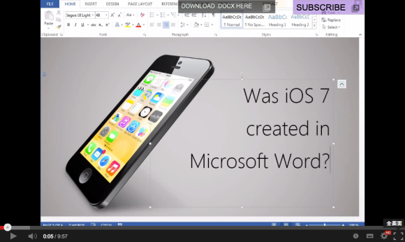
Since its release in 2007, the iPhone has taken the world by storm, garnering a massive following thanks to its simplistic design and sleek interface. Along with the gradual changes of its appearance, its operating system, iOS, has also made subtle changes with each update since the first version.
iOS 7, which was rolled out a couple of months ago, surprised users with a revamped look and feel which seemed to challenge the limits of simplicity with a flat user interface and bold colors. Doing away with excessive ornamentation, the explicitly simple design set some people thinking, was iOS 7 created in Microsoft Word? Václav Krejčí from the Czech Republic worked his magical skills with the word processing software to create an image replica of unbelievable quality, and you should really see it with your own eyes.
The entire replication process was documented in a clearly explained video, showing all the tools and tricks used to create the iOS 7 lookalike in Microsoft’s word processing software. Every default iOS icon was recreated with detail, entirely in Word.
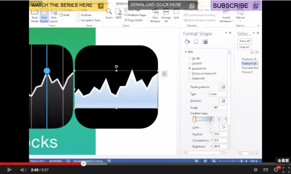
▼ Creating the rounded rectangle icons and using a grid for alignment.
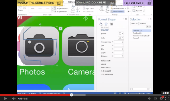
▼ Tracing lines to replicate irregular shapes.
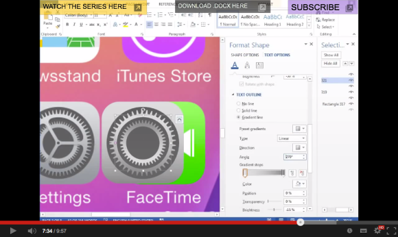
▼ Manipulating symbols and shapes to recreate icons.
▼ Playing with colors and gradients.
▼ Recreating complex details using simple shapes.
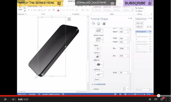
▼ Replicating the body of the mobile device.
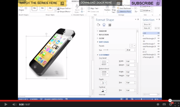
▼ Mapping on the face and dropping a shadow.
Many of our writers here at RocketNews24 use Microsoft Word to produce articles every single day, but to be honest we never imagined that the text editing software could achieve such visual intensity! You’ll have to see it to believe it.
That proves it, the iOS 7 user interface was designed in Microsoft Word. Or was it not? Well, that’s one trade secret that we’ll never know, but one thing we know for sure is that Václav Krejčí’s proficiency in creating images in a Word document is off the charts. Be sure to check out his YouTube channel to learn more fancy image conjuring tricks!



 Koreans angry as iPhone’s new iOS 7 displays disputed islands as Japanese territory
 Nintendo is coming to iPhones with Super Mario Run for iOS devices
 Gold Saucer on the go! Final Fantasy VII out now for iOS devices with skippable battles
 SoftBank’s White Dog Gets a Free Rap and DJ App for iOS (and It’s Awesome)
 Pokémon and Ikea Japan cross over into each other’s worlds with collaboration events
 Can a downtown Tokyo super sento bathhouse beat a hotel for a one-night stay?
 Fading Tokyo – Searching for signs of the Showa era as local neighborhoods evolve[Photos]
 A Kyoto factory vending machine sells gourmet mystery meals at bargain prices
 Sleep like a Pokémon with awesomely adorable new Pokémon Sleep pajama sets from Japan【Photos】
 Akihabara pop-up shop sells goods made by Japanese prison inmates
 Find a red envelope on the ground? Here’s why you should never pick it up
 Japan’s super easy sweet potato spread lets you make sweet potato bread thanks to Don Quijote
 Tokyo Station staff share their top 10 favorite ekiben
 The Four Lows: Many Japanese women’s new image of the ideal man
 Tokyo’s best museum for foreign travelers finally reopens after being closed for four years
 Pokémon lacquerware series expands for Year of the Horse with new handcrafted design[Video]
 Famous Tokyo cherry blossom spot installs view-blocking screens to fight overcrowding[Video]
 Tokyo subway and almost all Tokyo train lines now accepting credit card tap payments
 Totoro Fund line of beautiful artwork and apparel lets you help the real-world Totoro Forest
 Two food hacks take Japan’s convenience store fried chicken to amazing new sandwich heights
 Tokyo turns its phone booths into free Wi-Fi hotspots, and here’s how to use them
 Studio Ghibli adds new My Neighbour Totoro 2026 Corn Gift to its anime store for Mother’s Day
 Japan now has a special desk for people who work at home with a pet cat[Photos]
 Uniqlo announces new T-shirts for One Piece, Naruto and more for manga publisher’s 100th birthday
 Train station platform ramen store closes its doors on half a century of history in Tokyo
 Starbucks Japan releases new My Fruit³ Frappuccino at only 34 stores around the country
 Studio Ghibli releases Catbus pullback keychain that runs like the anime character
 Krispy Kreme releases Super Mario doughnuts in Japan for a limited time
 Japanese onsen egg maker from 100-yen store Daiso needs to be on your shopping list
 Nine great places to see spring flowers in Japan, as chosen by travelers (with almost no sakura)
 Survey asks foreign tourists what bothered them in Japan, more than half gave same answer
 Japan’s human washing machines will go on sale to general public, demos to be held in Tokyo
 Starbucks Japan releases new drinkware and goods for Valentine’s Day
 We deeply regret going into this tunnel on our walk in the mountains of Japan
 Studio Ghibli releases Kodama forest spirits from Princess Mononoke to light up your home
 Starbucks Japan releases new sakura goods and drinkware for cherry blossom season 2026
 Japan’s newest Shinkansen has no seats…or passengers [Video]
 Major Japanese hotel chain says reservations via overseas booking sites may not be valid
 Put sesame oil in your coffee? Japanese maker says it’s the best way to start your day【Taste test】
 No more using real katana for tourism activities, Japan’s National Police Agency says