Unusual design in Kansai is a clever example of thoughtful customer service, designed specifically with the user in mind.
Osaka, in the Kansai region, and Tokyo, in the Kanto region, pride themselves on doing things differently from each other, whether it involves rice balls at a convenience store or the way miso soup is positioned at the table.
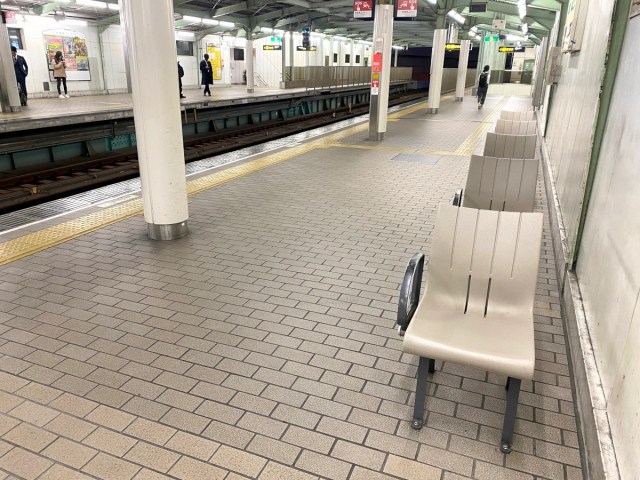
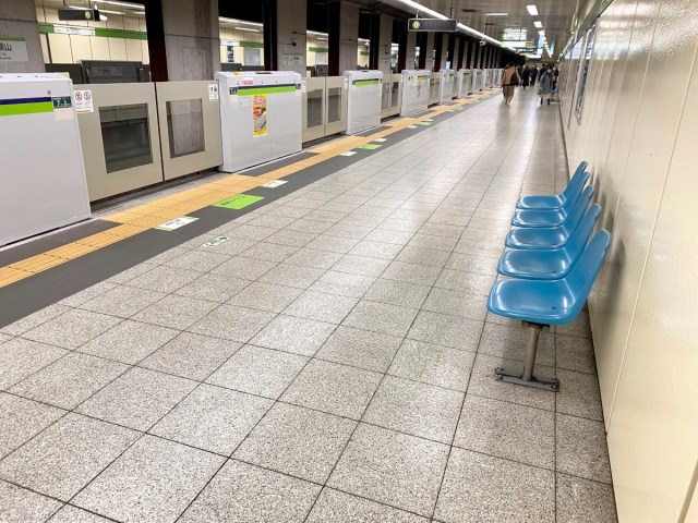
The differences don’t stop at food, however, because at train stations in the Kansai area, you’ll find that seats on some platforms look very different from those in Tokyo.
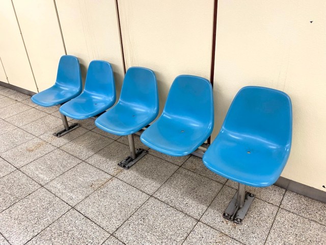
▼ An example of seats at a Tokyo train station…
▼ …and an example of seats at a train station in Osaka.
Our Tokyo-based reporter P.K. Sanjun took a trip to Osaka recently, and when he saw the seats he couldn’t help but wonder about the real reasons behind their design. Was this simply another case of Osaka doing things differently to Tokyo? Or was there another factor at play here?
In order to find out, he went straight to the local railway operator, West Japan Railway Company, to ask them why the seats are positioned away from the trains and their tracks, and they revealed three fascinating reasons for the design.
P.K.: I’ve seen this at stations in Osaka and Hyogo so I wanted to ask — why are the seats facing parallel to the platform? It’s something you don’t see in Kanto…”
JR West: “Well, the main reason is to prevent drunken customers from falling (onto the tracks). Until they were installed, there were numerous cases where drunk customers who’d been sitting on the seats stood up and fell off the platform.”
P.K.: “So it’s to prevent drunken people from falling off the platform? Does that mean the design was different before?”
JR West: “Yes, it would take some time for me to check when they were formally introduced, but from what I remember the new seat configurations first appeared around five to six years ago.”
P.K.: “Hmmm. But if the purpose is to prevent falls, shouldn’t platform doors be installed instead? I feel like I’m seeing a lot more of them at stations in the city centre.”
JR West: “I understand what you’re saying. However, Kansai has a complicated network of routes, so it may be a little difficult to install platform doors everywhere. Major stations such as Osaka, Tsuruhashi, Kyobashi, and Sannomiya have platform doors, though.”
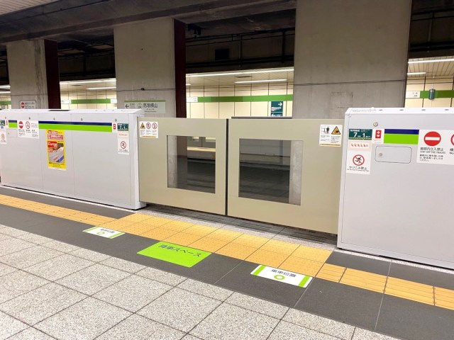
▼ Compared to Osaka, Tokyo currently has a lot more of these platform doors installed at stations.
P.K.: “I see. I guess the installation of platform doors must be very costly. Seats might be a more cost-effective countermeasure.”
JR West: “I don’t know the details of the cost, but I think that’s probably part of the reason. JR West has been changing the seat positions at a large number of station platforms over the past few years.”
P.K.: “Well, that clears things up! Thank you!”
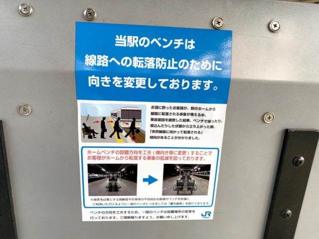
Following his conversation with JR West, P.K. discovered that the main reason for the unusual seat positioning was to protect drunken customers from falling off the platform. And sure enough, when he was passing through another station in the region, he found a poster showing the change in the position of the seats, along with an explanation that the new configuration was designed to protect against drunken falls.
Drunken falls are a big problem at train stations throughout Japan, so much so that you’ll commonly find posters warning commuters of the dangers. It’s one of the reasons why platform doors are being installed at a number of stations but given the costs involved, and the fact that Japan’s rail network is wide and varied, a nationwide rollout would be a difficult and time-consuming task.
Still, while there are hurdles to making hurdles, that doesn’t mean a railway operator in Japan will sit on its hands and claim nothing can be done to fix the problem. So kudos to JR West for looking for an alternative solution and coming up with the simple yet effective idea to change the position of the seats.
▼ A simple change has the potential to save lives.
The seats at Kansai train station platforms are yet another example of how Japan’s dedication to customer service can lead to innovative UX (user experience) design that creates a meaningful, relevant, and memorable experience for users.
It’s a simple design idea that makes a big difference to the daily life of customers, just like elevators with mirrors, red-and-yellow markings on stairs and even giant locks on Japanese toilet doors!
Photos ©SoraNews24
● Want to hear about SoraNews24’s latest articles as soon as they’re published? Follow us on Facebook and Twitter!
[ Read in Japanese ]

 New Japanese mascot character: A train station monster that grabs children who don’t mind the gap
 Japan travel alert: Cheapest seats on fastest Shinkansen will not be offered for Golden Week
 Japanese train station building set up in just two hours with the help of 3D printing
 Shinkansen to permanently reduce number of inexpensive non-reserved seats on Nozomi trains
 Sanyo Shinkansen ending in-car food cart sales (unless you’ve got the cash for first-class)
 Train station platform ramen store closes its doors on half a century of history in Tokyo
 Starbucks Japan opens new Kyoto store in Place of Scenic Beauty
 Virtual idol Hatsune Miku redesigned with look that adds new elements and brings back old ones
 Is this Japan’s most extreme cherry blossom viewing? Leap, cycle and climb through 2,500 sakura
 Komachi Shokudo: Japanese mum’s-style cooking for breakfast, lunch and dinner in Tokyo
 Man in Japan falls into hole with a bear in it
 Studio Ghibli adds new Mother’s Day gift sets to its anime collection in Japan
 Huge life-size Eevee Eeveelution Pokémon plushies will steal hearts, conquer living rooms【Photos】
 Häagen-Dazs Japan releases new ASMR ice cream called “Rocky Crunchy!”
 Otaku crime: Kyoto police arrest man for selling counterfeit ultra-rare Yu-Gi-Oh! card
 Studio Ghibli releases Catbus pullback keychain that runs like the anime character
 Nine great places to see spring flowers in Japan, as chosen by travelers (with almost no sakura)
 Starbucks Japan opens new cafe and art gallery in top Tokyo tourist neighbourhood
 Is Japan’s Crab-shaped Cup Ramen Timer worth the hype?
 Pizza Hut Japan teams up with creator of one of the country’s best kinds of ramen for ramen pizza
 Starbucks Japan releases a new Cream Puff Frappuccino for a limited time
 The top 10 graduation songs in Japan as chosen by current Japanese high school students
 Pikachu and Eevee become handmade Lladró porcelain sculptures to celebrate Pokémon’s 30th birthday
 Starbucks Japan releases new sakura goods and drinkware for cherry blossom season 2026
 Starbucks Japan unveils new sakura cherry blossom collection for hanami season 2026
 Foreign tourists in Japan will get free Shinkansen tickets to promote regional tourism
 The 10 most annoying things foreign tourists do on Japanese trains, according to locals
 Super-salty pizza sends six kids to the hospital in Japan, linguistics blamed
 Starbucks Japan unveils new sakura Frappuccino for cherry blossom season 2026
 Naruto and Converse team up for new line of shinobi sneakers[Photos]
 Starbucks Japan releases first-ever Hinamatsuri Girls’ Day Frappuccino
 Survey asks foreign tourists what bothered them in Japan, more than half gave same answer
 Japan’s human washing machines will go on sale to general public, demos to be held in Tokyo
 Starbucks Japan releases new drinkware and goods for Valentine’s Day
 We deeply regret going into this tunnel on our walk in the mountains of Japan
 Studio Ghibli releases Kodama forest spirits from Princess Mononoke to light up your home
 Japan’s newest Shinkansen has no seats…or passengers [Video]
 Major Japanese hotel chain says reservations via overseas booking sites may not be valid
 Put sesame oil in your coffee? Japanese maker says it’s the best way to start your day【Taste test】
 No more using real katana for tourism activities, Japan’s National Police Agency says
 Japan Railway doing away with train departure chimes in plan to stop dangerous mad dashes
 Japanese train station returns lost item to customer with a heartwarming message
 World’s first 3D-printed train station building planned by JR West
 See a whole other side of Kyoto in this beautiful, quintessentially Japanese train, coming soon
 Japan’s newest Shinkansen has no seats…or passengers [Video]
 A video visit to Doai, one of Japan’s most terrifying train stations【Video】
 Attack on Toilets now going on inside Osaka train station bathrooms
 Japan’s “new normal” train manners poster: 7 steps for safe travel during the pandemic
 You can now buy a Japanese train station clock in Japan
 Japan’s new random-destination die-roll train tickets — Amazing bargain for just 36 bucks
 Attempted murder at a Japanese train station
 Case Closed: Detective Conan passenger trains in Tottori are about to get a fresh new look
 Pokémon photo spots popping up in center of Japan’s third-biggest city for Japan Railway event
 Seats descend from ceiling on Japanese train to provide extra comfort for passengers【Video】
 Shinkansen will require reservations for large suitcases, charge penalty fees for those without