

For a country that allegedly has little contact with the outside world, North Korea somehow manages to end up in the news an awful lot. While it’s hard to tell how much of what we hear and read is true, sometimes a nugget of truth–beautiful, hilarious truth–slips through the cracks of propaganda on both sides of the ideological line and leaves us giggling.
As you’ve probably heard, the Democratic People’s Republic of Korea (DPRK) has recently unveiled the logo for their year-old space agency, NADA. Though they may have expected fanfare or at least a bit of grudging respect, the main response they got was an Internet full of giggles.
A few problems are at the root of the mirth surrounding the announcement. First, while April 1 probably doesn’t seem to have much significance as a day for pranks and humorous lies in North Korea, for the rest of the Internet, it’s nearly impossible to take anything seriously. In fact, if the DPRK ever wanted to claim a victory over their enemies, they could just launch an all out attack on midnight of April Fools’ Day and we’d all be too busy laughing to react. So showing off your new logo on the silliest of silly days is a recipe for leaving people wondering, “Wait, did North Korea go back in time and kidnap a graphic designer from 1965 or did every major newspaper in the world get together to play the weirdest April Fools’ joke ever?”
Based on a press release found in the Rodong Sinmun, the official newspaper of the Central Committee of the Workers’ Party of Korea, it looks like this is no April Fool’s joke. Which brings us to the other issue with the logo’s big reveal: The logo itself. As a number of websites have already pointed out, the North Korean space agency’s logo is suspiciously similar to NASA’s current logo, which was originally created in 1959. But is it really a fair comparison? Well, take a look for yourself.
▼We never noticed before, but why is there a giant
red labia flying through space on the NASA logo?

▼Hey, North Korea’s version has a much less
ostentatious number of stars! See, so different!

Okay, so the logos are pretty similar. But what about other space agency logos? Maybe the DPRK is just following a well-worn path. Here are logos for 12 of the world’s various space agencies.
Top row: China Aerospace Science and Technology Corporation, Russian Federal Space Agency, JAXA, European Space Agency, Indian Space Research Organisation, National Centre for Space Studies (France).
Bottom row: Italian Space Agency, Canadian Space Agency, Space and Upper Atmosphere Research Commission (Pakistan), UK Space Agency, Iranian Space Agency, German Aerospace Center
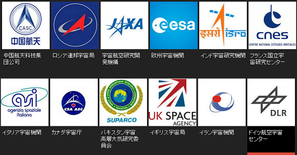
Well, we are seeing a lot of blue and a lot of circles…but there aren’t really any that have the same sort of bland logo over a blue sphere with stars–except maybe Canada’s space agency. But the maple leaf adds some uniqueness for the northern country.
So, is it fair to suggest that North Korean is aping or ripping off NASA? We’ll leave that one up to you, but in case you want the DPRK’s take on it, here’s their official explanation of the logo:
“The emblem of the NADA was recently instituted, which represents its character, mission, position and development prospects.
Seen in the lower part of the globe-shaped dark blue emblem are white-colored letters ‘Kukgaujugaebalkuk’ (National Aerospace Development Administration) in Korean and in its upper part light blue-colored letters “DPRK” with the Great Bear above them. Printed in its middle are white-colored letters “NADA” in English.
Two light blue-colored rings intercrossing the emblem symbolize satellite orbits.
The Great Bear reflects the will of the space scientists of the DPRK to glorify Kim Il Sung’s and Kim Jong Il’s Korea as a space power.
The globe represents the DPRK’s idea for peaceful development of the space and the rings show the DPRK’s will to launch satellite into all orbits.”
There is one more cause for laughter for netizens though: The space agency’s name. But what’s in a name, as zombie Shakespeare would ask before nibbling on your thigh muscle.
In case you’ve forgotten your high school Spanish, here’s a quick reminder: “Nada” means “nothing.” Obviously, this was hardly the intention of the reclusive country! After all, the translated name of the space agency reads as “National Aerospace Development Administration,” whose acronym would clearly be NADA. Of course, it’s not helping that they’ve so far had only a little luck in the space race, leaving some of us to wonder if it’s not a name but rather the count of their successes. Still, it’s not like “NADA” is actually a rare acronym–here’s a list of 21 other meanings for the four letters.
So is it really fair to laugh at North Korea’s selection? Probably not…but we still haven’t stopped giggling!
Sources: Wall Street Journal, The Guardian, Huffington Post Japan, Independent, Korean News Service, Rodong Sinmun (link may not work)
Images: Rodong Sinmun (link may not work), Wikipedia, Google Image Search
 Beautiful exclusive Totoro tenugui towel is a gift from Disney to Ghibli physical media buyers
 Brand new Shinkansen bullet train unveiled in Japan… but it won’t carry passengers
 Sanrio eco-friendly plushies are here for the earth-conscious lovers of all things kawaii
 Studio Ghibli releases anime T-shirts that pay homage to one of Hayao Miyazaki’s most personal films
 Cup Noodle releases cold-water instant ramen in Japan, but can it really be made with just cold water?
 Japanese convenience store releases Japanese convenience store-flavor fried chicken
 Hatsune Miku collaborates with Hokusai’s art in new Vocaloid ukiyo-e illustration series [Pics]
 Giant Snorlax, other snoozing Pokémon appear in Yokohama for Pokémon Sleeping Faces Research [Pics]
 Taco sandwiches appear in Japan with new Lunch Pack sandwich pocket flavor[Taste test]
 Japan’s “edible fireworks” wagashi sweets return, but only for a limited time [Photos]
 Japan now has human refrigerators inspired by Japanese vending machines
 Cup Noodle unveils first-ever cold-water instant ramen in Japan
 Family Mart’s new Tokyo flagship convenience store doesn’t feel convenient, but is that a problem?
 Starbucks Japan releases new Discovery Series collection celebrating local regions and traditions
 Teen girl in Japan refuses to be victim, personally escorts train pervert to police for arrest
 Is Japan’s tourism boom slowing down? Foreign visitor numbers fall for first time in five years
 Evangelion beautifully reimagined as iconic classical Japanese folding screen art series [Photos]
 Japan announces sudden 400-percent increase in visa fees for foreigners entering the country
 Studio Ghibli has a new anime out, and there’s only one place in the world where you can see it
 Salomon releases Japan-exclusive Mt. Fuji hiking gear that doubles as an amazing souvenir
 Japan triples departure tax, foreign tourists and locals now must pay more to leave country
 Japanese ninja certification exam attracts 131 candidates from Japan and abroad
 Family Mart opens new “Famima” flagship store in Tokyo that’s like a tourist attraction
 Japan’s human washing machines will go on sale to general public, demos to be held in Tokyo
 Starbucks Japan releases new drinkware and goods for Valentine’s Day
 Starbucks Japan releases new sakura goods and drinkware for cherry blossom season 2026
 Japan’s newest Shinkansen has no seats…or passengers [Video]
 Put sesame oil in your coffee? Japanese maker says it’s the best way to start your day【Taste test】
 Japan reportedly adding Japanese language skill requirement to most common foreigner work visa
 Japanese convenience store releases Japanese convenience store-flavor fried chicken
 Hatsune Miku collaborates with Hokusai’s art in new Vocaloid ukiyo-e illustration series [Pics]
 Giant Snorlax, other snoozing Pokémon appear in Yokohama for Pokémon Sleeping Faces Research [Pics]
 Taco sandwiches appear in Japan with new Lunch Pack sandwich pocket flavor[Taste test]
 Japan’s “edible fireworks” wagashi sweets return, but only for a limited time [Photos]
 Studio Ghibli’s new moving keychains are the angry, adorable bugs from Nausicaa [Photos]
 Teen girl in Japan refuses to be victim, personally escorts train pervert to police for arrest
 Japan now has human refrigerators inspired by Japanese vending machines
 Japanese curry rice burger gets all the attention in Mos Burger’s new birthday celebration campaign
 Family Mart’s new Tokyo flagship convenience store doesn’t feel convenient, but is that a problem?
 Japan’s popular curry chain Cocoichi has an elusive delivery-only noodle menu
 Starbucks Japan unveils new peach milk pudding drink that’s like a decadent dessert
 Starbucks Japan releases new Discovery Series collection celebrating local regions and traditions
 Mos Burger opens Mosh Burger & Bar in Ginza, but is it fated to be a short-lived sensation?