Is the storied L.A. franchise ripping off the uniform of the Japanese club, or is this just a case of “What goes around comes around?”
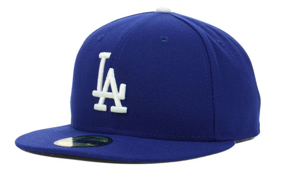
Unlike a lot of other teams in professional baseball, the Dodgers don’t really tweak their uniforms very often. When they relocated to the West coast from Brooklyn in 1958, they adopted their iconic interlocking LA logo. They’ve kept it for every game since, barring about a half-dozen games in 2011 and 2012 in which they donned caps with the Brooklyn B to honor their roots and legendary former Dodger Jackie Robinson.
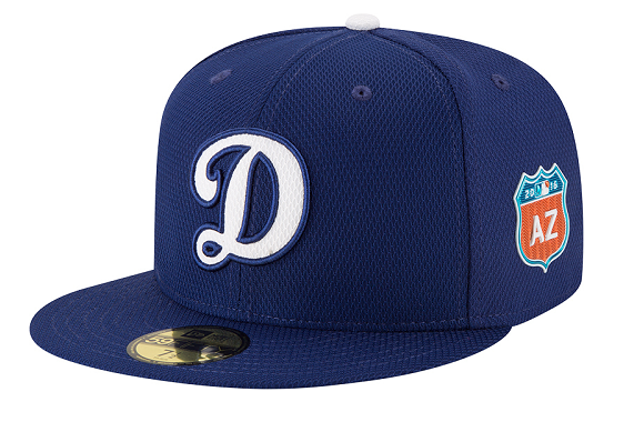
As one of the most enduring logos in professional sports, just seeing it instills a sort of pride in Los Angeles sports fans. Come spring training, though, the Dodgers will be rocking a new design in selected games which replaces the initials of their home turf with a D.
It’s not a bad look, and rendering the D in the classic font in which “Dodgers” is written on the team’s jerseys makes it instantly understandable what the letter stands for. The shift is also sort of appropriate for spring training games, which are played in Arizona of Florida (with the corresponding state highway signs on the side of the hat). Some local spectators catching an exhibition game might even be more enticed to buy a cap and support the team since the new design won’t have the side effect of making them look like they’re ready to start singing “I Love L.A.”
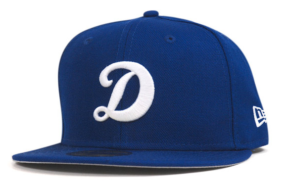
Since the start of spring training is still a few months away, you can’t buy a blue and white D cap yet. Well, at least not in America. In Japan, on the other hand, they’ve been available for almost 30 years.
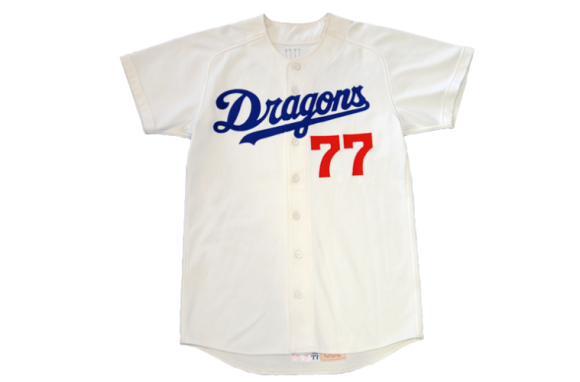
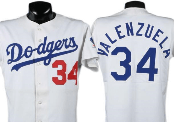
That’s the cap worn by the Chunichi Dragons, who play their home games in Nagoya, from 1987 to 1996. But before you go calling foul on the Dodgers for lifting the Dragons’ logo, here’s the jersey the Dragons wore during that same span of time.
Hmm…where have I seen something like that before?
▼ Oh, that’s right.
The Dragons’ uniforms from the late 1980s to mid-‘90s were just the Dodgers’ with the text changed, but the exact same font, spacing, and number placement. The above Fernando Valenzuela jersey is from 1983, and the Dodgers had been using this design for several years prior to that.
This isn’t the only instance of a Japanese team heavily borrowing elements of its uniform from an American club. Unless you notice the subtle difference in hue, it’s extremely easy to mistake the Hiroshima Carp’s hats for the Cincinnati Reds’. For many years, Tokyo’s Yomiuri Giants copied the uniforms, colors, and even name of Major League Baseball’s San Francisco Giants.
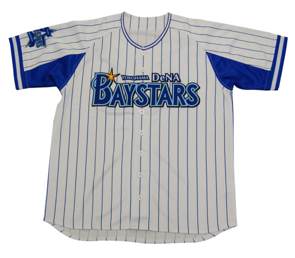
▼ Meanwhile, the Yokohama Baystars remain pure in the originality of their uniforms (and also championship-less since 1998).
In the Dragons’ defense, they’ve gotten a little more original in the uniform department in recent years, and have even switched to caps with an interlocking CD logo. Taking that into consideration, there’s really nothing wrong with the Dodgers rocking the D caps during spring training. The Dragons aren’t using them, and really, the Dodgers are just taking them back.
Follow Casey on Twitter if you need someone to share your pain from the Baystars’ numerous losses.
Source: Dodger Insider
Insert images: Lids, Dodger Insider, Hat Club, Chunichi Dragons, Bidami, Yokohama DeNA Baystars

 One Piece sets sail for Dodger Stadium for One Piece Night pro baseball event and giveaways
 Exclusive Super Mario Yoshi figure to be given away at Dodgers Stadium [Video]
 Pikachu helmets are coming to Japanese pro baseball team’s uniforms【Photos】
 Demon Slayer: Kimetsu no Yaiba comes to Dodger Stadium for fan night, first pitch, and drone show
 Every Japanese pro baseball team to play with Mario question block bases once this year
 Family Mart unveils new Japanese bread that elevates convenience store food to mocchiri levels
 McDonald’s and Gundam team up for customized anime mecha and fried chicken sandwiches[Video]
 Peanuts and Coke becomes a viral hit in Japan, but is it a trend worth joining?
 New 7-Eleven sandwich goes viral in Japan, but is it everything it’s cracked up to be?
 Schoolkids learn life skills through shopping field trips at street markets in Kochi Prefecture
 Famous koi ponds overwhelmed with tourists throwing thousands of coins in them
 How to take your home ramen to the next level by making your own chashu pork in a frying pan
 Japan reportedly adding Japanese language skill requirement to most common foreigner work visa
 Deer that appeared in downtown Osaka gets a new home, a new name, and a lot of snacks[Video]
 Häagen-Dazs releases new Green Tea sandwich in Japan for a limited time
 Pokémon and Ikea Japan cross over into each other’s worlds with collaboration events
 Starbucks Japan closing only Shinkansen platform branch for popularity-triggered renovations
 Two food hacks take Japan’s convenience store fried chicken to amazing new sandwich heights
 You can assemble a well-balanced team of Pokémon, them eat them, thanks to Japanese cake chain
 Tokyo turns its phone booths into free Wi-Fi hotspots, and here’s how to use them
 Fading Tokyo – Searching for signs of the Showa era as local neighborhoods evolve[Photos]
 Tokyo teahouse serves up a sakura matcha dessert you won’t find anywhere else
 7-Eleven Japan’s new baked-in-store sweet treat is only available in three parts of the country
 Man bites woman at cherry blossom park in Japan, dies shortly after
 Japan now has a special desk for people who work at home with a pet cat[Photos]
 Famous Tokyo cherry blossom spot installs view-blocking screens to fight overcrowding[Video]
 Uniqlo announces new T-shirts for One Piece, Naruto and more for manga publisher’s 100th birthday
 Train station platform ramen store closes its doors on half a century of history in Tokyo
 Starbucks Japan releases new My Fruit³ Frappuccino at only 34 stores around the country
 Studio Ghibli releases Catbus pullback keychain that runs like the anime character
 Krispy Kreme releases Super Mario doughnuts in Japan for a limited time
 Japanese onsen egg maker from 100-yen store Daiso needs to be on your shopping list
 Survey asks foreign tourists what bothered them in Japan, more than half gave same answer
 Japan’s human washing machines will go on sale to general public, demos to be held in Tokyo
 Starbucks Japan releases new drinkware and goods for Valentine’s Day
 We deeply regret going into this tunnel on our walk in the mountains of Japan
 Starbucks Japan releases new sakura goods and drinkware for cherry blossom season 2026
 Studio Ghibli releases Kodama forest spirits from Princess Mononoke to light up your home
 Japan’s newest Shinkansen has no seats…or passengers [Video]
 Major Japanese hotel chain says reservations via overseas booking sites may not be valid
 Put sesame oil in your coffee? Japanese maker says it’s the best way to start your day【Taste test】
 No more using real katana for tourism activities, Japan’s National Police Agency says
 One Piece teams up with the Los Angeles Lakers for pirate anime/pro basketball crossover
 Naruto jerseys coming to Major Leage Baseball theme nights, Hello Kitty to take over a field