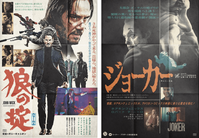
Talented fan takes John Wick, Pikachu, and Marvel heroes back to the golden era of Japanese poster graphic design.
In our modern world, online trailers and video teasers are the way to drum up interest in a movie. But turn the calendar back to the 1970s or early ‘80s, before everyone had at least one Internet-capable device within arm’s reach at any given moment, and awesomely designed posters were the way to get people hyped.
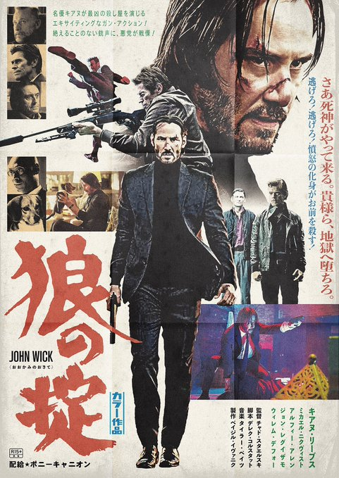
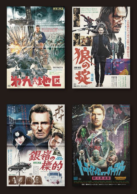
Making a good poster was a serious challenge. The designer had only a single piece of paper in which to establish the characters and atmosphere to get people interested enough to buy a ticket, and couldn’t rely on music or motion to help. And yet, the right artist could pull it off, like in this awesome looking poster for John Wick, showing Keanu Reeves standing tall in a display of old-school badassery.
#RTで私を有名にしてください
— コンビーフ太郎 (@UMAI_ONIKU_TARO) February 11, 2020
たまに映画ポスターを勝手に作っています。#映画 #ポスター #ファンメイド pic.twitter.com/T42ewOwfc5
…except, wait a second. John Wick came out in 2014! Did some graphic designer from 1970s Japan travel four decades into the future, stick around just long enough to watch the movie, then go back to his own time and put this poster together?
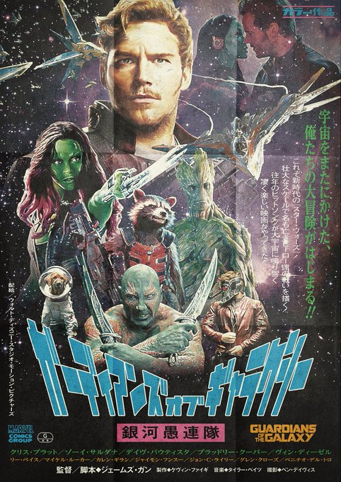
Nope, because you don’t need a time-traveling artist when the spirit of retro poster design lives on today in the heart of Japanese Twitter user Corned Beef Taro (@UMAI_ONIKU_TARO), whose hobby is making poster-style movie fan art. Here’s another, this time for Guardians of the Galaxy.
While there are still exceptions, the increasingly global nature of movie marketing means most Hollywood blockbusters come out in Japan with a title that’s pretty similar to the one for their U.S. release. Back in the ‘70s, though, replacing English titles with a Japanese one was more common, so for his John Wick poster above, Corned Beef Taro bills the picture as Okami no Okite (“Law of the Wolf”), and the Guardians are referred to as the Ginga Gurentai (“Galaxy Hoodlum Squad”).
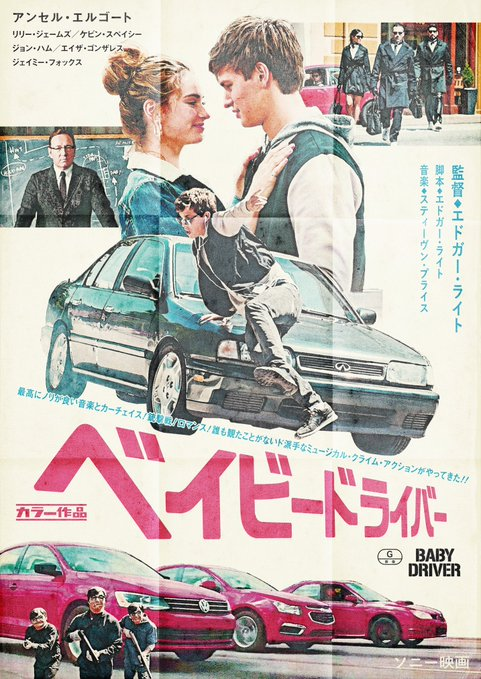
▼ Baby Driver is still Baby Driver, though, just rendered in katakana phonetic script. The poster also boasts that it was shot in color, which was still something to be kind of proud of in the poster’s aesthetic era.
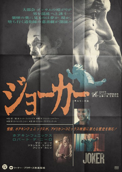
One of Corned Beef Taro’s most interesting efforts is his creation for Joker, a movie that came out in 2019, but was shot with set and costume design akin to the time period Corned Beef Taro’s posters evoke.
He’s also created posters for Guardians of the Galaxy Vol. 2…
https://twitter.com/UMAI_ONIKU_TARO/status/1119445713199362049…Blade Runner 2049, which he’s retitled Ame no Karibito (“Rain Hunter”) Part 2…
今年4月に初めて映画ポスターを投稿した。当時はフォロワー0、つまり見ている人なんていなかった。
— コンビーフ太郎 (@UMAI_ONIKU_TARO) December 31, 2019
その後ヨロコヴさんにフックアップしてもらって、大勢と繋がった。思ってもみない事だった。楽しい一年だった。皆さんに感謝。
そしてその最初の作品は『ブレードランナー2049』。 pic.twitter.com/yM95n2IxlN
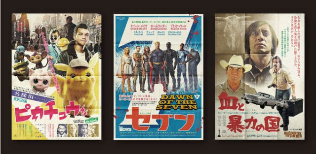
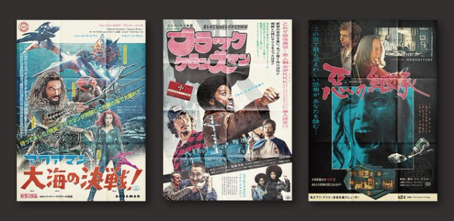
…and a whole bunch of other films, including District 9, Detective Pikachu, No Country for Old Men, Aquaman, and Black Clansman, all looking very shibui.
プチバズりしたので、ここぞとばかりに宣伝です。たまにファンアートの映画ポスターを勝手に作って晒しています。たまに覗いてみて頂けると幸いです。 pic.twitter.com/6BG277EPhq
— コンビーフ太郎 (@UMAI_ONIKU_TARO) January 19, 2020
Best of all, with Corned Beef Taro proving he can adapt even the newest of movies into the style of the ‘70s, we can probably look forward to more blasts to the past in the future.
Source: Twitter/UMAI_ONIKU_TARO via IT Media
Top image: Twitter/@UMAI_ONIKU_TARO
Insert images: Twitter/@UMAI_ONIKU_TARO (1, 2)
● Want to hear about SoraNews24’s latest articles as soon as they’re published? Follow us on Facebook and Twitter!

 Starbucks Japan releases new Frappuccino and latte for Valentine’s Day
 Our 52-year-old pole dancing reporter shares his tips for achieving your New Year’s exercise goal
 Ramen restaurant’s English menu prices are nearly double its Japanese ones, denies discriminating
 Here’s what our bachelor writers ate over the New Year’s holiday in Japan
 Shinkansen stopped and searched by police because of passenger who really had to pee
 Starbucks Japan releases new Frappuccino and latte for Valentine’s Day
 Our 52-year-old pole dancing reporter shares his tips for achieving your New Year’s exercise goal
 Ramen restaurant’s English menu prices are nearly double its Japanese ones, denies discriminating
 Here’s what our bachelor writers ate over the New Year’s holiday in Japan
 Shinkansen stopped and searched by police because of passenger who really had to pee
 What’s inside Starbucks Japan’s fukubukuro lucky bag for 2026?
 Switch 2 announced by Nintendo, wisely switches up very little【Video】
 Giant hotel rooms in Osaka reflect the new non-niche face of travel in Japan.
 Hey, Japanese taxi driver! Take us to the best Turkish rice restaurant in Nagasaki!
 Lace boxer briefs for men: Japanese company creates underwear that’s beautiful and functional
 10 times to avoid traveling in Japan in 2026
 Japanese beef bowl chain Sukiya’s 2026 Smile Box lucky bag basically pays for itself
 Top Japanese cosplayer Enako returns to Comiket after 6 years, creates mayhem with admirers
 Umamusume anime girl plushie recalled for having parts she absolutely should not have【Pics】
 We ate sushi made from Japan’s most expensive tuna ever【Taste test】
 Princess Mononoke magnets return just in time to treat yourself to awesome anime decorations
 Starbucks Japan ready to get Year of the Horse started with adorable drinkware and plushies【Pics】
 7-Eleven Japan starts new temporary luggage storage service in over 300 branches
 Disillusionment at Tsukiji’s tourist-target prices led us to a great ramen restaurant in Tokyo
 Starbucks teams up with 166-year-old Kyoto doll maker for Year of the Horse decorations【Photos】
 Tokyo’s Tsukiji sushi neighborhood asks tour groups to stay away for the rest of the month
 Japan may add Japanese language proficiency, lifestyle classes to permanent foreign resident requirements
 Lacquerware supplier to emperor of Japan and Pokémon team up for new tableware
 Starbucks Japan releases new zodiac chilled cup drink for 2026
 Survey asks foreign tourists what bothered them in Japan, more than half gave same answer
 Japan’s human washing machines will go on sale to general public, demos to be held in Tokyo
 We deeply regret going into this tunnel on our walk in the mountains of Japan
 Studio Ghibli releases Kodama forest spirits from Princess Mononoke to light up your home
 Major Japanese hotel chain says reservations via overseas booking sites may not be valid
 Put sesame oil in your coffee? Japanese maker says it’s the best way to start your day【Taste test】
 No more using real katana for tourism activities, Japan’s National Police Agency says
 Starbucks Japan reveals new sakura drinkware collection, inspired by evening cherry blossoms
 Updated cherry blossom forecast shows extra-long sakura season for Japan this year
 Human washing machine pods coming to Japanese hotels【Photos】
 What’s inside Starbucks Japan’s fukubukuro lucky bag for 2026?
 Switch 2 announced by Nintendo, wisely switches up very little【Video】
 Giant hotel rooms in Osaka reflect the new non-niche face of travel in Japan.
 Hey, Japanese taxi driver! Take us to the best Turkish rice restaurant in Nagasaki!
 Lace boxer briefs for men: Japanese company creates underwear that’s beautiful and functional
 New Tokyo restaurant charges higher prices to foreign tourists than Japanese locals
 The difference between onigiri rice balls in Tokyo and Osaka
 Japan’s Valentine’s Day gets extra cute with the return of KitKat Heartful Bear【Photos】
 Playing with middle-aged men: What’s with the new rash of “oji-san” smartphone apps?
 Play games, learn, and get your fortune at Ginza’s limited-time Tsunaguu “Shrine of the Future”
 Is your girlfriend a cat, dog, gorilla or penguin type? Take this Twitter comic test to find out!
 Umamusume anime girl plushie recalled for having parts she absolutely should not have【Pics】
Leave a Reply