
 I can’t recall how many times mobile phones and mp3 players have slipped out of the front pocket of my shirt. Always ending with that cringe inducing thud as my precious device hits the cold hard ground. There was even one incident involving a turtle pond and now-gone iPod Classic that I can’t bear to go into.
If someone was videotaping all these moments in my life it would have made an excellent opening to a commercial for K-Pocke (pronounced like pokemon), a pocket designed so that nothing slips out.
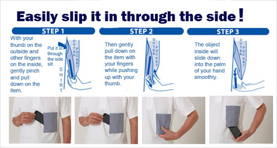
The patented function of K-Pocke seems simple enough. It’s a double layered pocket that allows you to slip items (especially smartphones) in through the slits on the side. Once inserted the items are trapped inside the pockets they won’t come out not matter how much shaking or bending over you do – that didn’t sound right.
There’s also an “outer pocket” accessible through the top if you like doing things the old-fashioned way, but beware of slippage.
When you want to remove your items you just pinch it out through the bottom as easy as popping out a button. It’s a fantastic concept that fixes a fundamental problem of daily life. Even with button shirts mobile phones and other items can still find their way out sometimes.
There appears to be one flaw with K-Pocke, however. Whoever designed the colors and patterns seems to be legally blind. I don’t claim to be a paragon of fashion but even my highly primitive sense of color is hurt by these designs.
Probably the key to K-Pocke’s future is some more reasonable combinations than what they have available now. But the K-Pocke Shop has only been open since 14 June. Perhaps with a wider variety of colors they can avoid the fate of the pocket protector: highly useful but socially debilitating.
Source: K-Pocke via IT Media (Japanese)
Watch the K-Pocke in action.
An example of a K-Pocke polo shirt available from the K-Pocke store.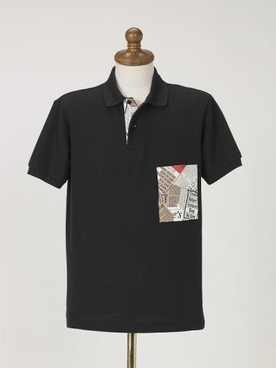
This is probably their most subtle design at the moment.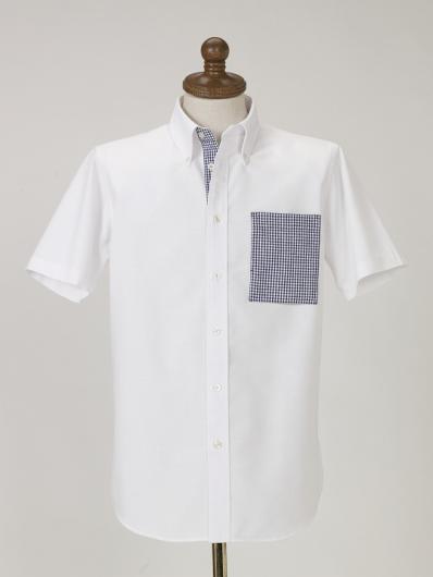
 Cup Noodle unveils first-ever cold-water instant ramen in Japan
 Japanese government ID card and app to be required for certain Pokémon card purchases next month
 Studio Ghibli releases new Totoro coin purses…but who’s the blue character?
 Tokyo’s Giga Mart lets visitors “steal” from a convenience store… if cameras don’t catch you
 Studio Ghibli has a new anime out, and there’s only one place in the world where you can see it
 Starbucks Japan adds shaved ice desserts to the menu at select locations
 Hiker needs to be rescued from Mt. Fuji two times in two days, but system is working as intended
 Uniqlo looks back to the very start of Pokémon with new black-and-white pixel art T-shirts[Pics]
 Studio Ghibli brings anime characters to the table with new Totoro placemat that’s like a movie cell
 Onidon opens in Tokyo with unique fusion tempura rice balls you won’t find anywhere else
 Family Mart opens new “Famima” flagship store in Tokyo that’s like a tourist attraction
 Japan reacts to Donald Trump’s “Islamic Republic of Japan” remark
 Japanese airport rebrands itself as “Sushi Airport” to attract foreign tourists
 Three new starter Pokémon Jets to fly in Japan, first begins carrying passengers this month
 New Mt. Fuji overnight bus takes travelers from downtown Tokyo straight to the most popular hiking trail
 Tokyo revises accommodation tax amidst tourism boom, Airbnb rentals now included
 Yoshinoya and Dragon Quest slaying scalpers with shift to made-to-order collaboration merch
 Tochigi man shares his family’s process for creating 16 years worth of rice paddy art
 Japan announces sudden 400-percent increase in visa fees for foreigners entering the country
 Japanese ninja certification exam attracts 131 candidates from Japan and abroad
 Salomon releases Japan-exclusive Mt. Fuji hiking gear that doubles as an amazing souvenir
 Studio Ghibli store Donguri Republic announces opening of first-ever store in America
 Japan triples departure tax, foreign tourists and locals now must pay more to leave country
 Japanese sweets shop sells an ohagi so exquisite it sells out by noon
 Sanrio Character Poll announces winners, Hello Kitty absent from top 10 in many countries
 Japan’s human washing machines will go on sale to general public, demos to be held in Tokyo
 Starbucks Japan releases new drinkware and goods for Valentine’s Day
 Starbucks Japan releases new sakura goods and drinkware for cherry blossom season 2026
 Japan’s newest Shinkansen has no seats…or passengers [Video]
 Put sesame oil in your coffee? Japanese maker says it’s the best way to start your day【Taste test】
 Japan reportedly adding Japanese language skill requirement to most common foreigner work visa
 Starbucks Japan adds shaved ice desserts to the menu at select locations
 Hiker needs to be rescued from Mt. Fuji two times in two days, but system is working as intended
 Uniqlo looks back to the very start of Pokémon with new black-and-white pixel art T-shirts[Pics]
 Studio Ghibli brings anime characters to the table with new Totoro placemat that’s like a movie cell
 Onidon opens in Tokyo with unique fusion tempura rice balls you won’t find anywhere else
 Japan’s new Calpis pudding: The right call for summer, or tampering with purin perfection?
 7-Eleven Japan reimagines the fruit sando with new chocolate bread version
 Japanese recipe for Tempura Twinkies takes America’s favourite snack to a whole new level
 Man arrested in Tokyo after allegedly luring foreign tourists into shady Kabukicho establishments
 Family Mart opens new “Famima” flagship store in Tokyo that’s like a tourist attraction
 Burger King Japan goes viral for its new Big Mouth Dirty, but is it really worth the hype?
 Japan reacts to Donald Trump’s “Islamic Republic of Japan” remark
 Studio Ghibli calendar figures are back, look amazing whether you check the date or not[Photos]
 Krispy Kreme Japan’s free doughnut deal could sway you from a convenience store breakfast