Tokyo Governor Yoichi Masuzoe revealed the capital city’s new logo at a press conference in the nation’s capital on Friday, and the simple design, featuring the one-line catchphrase “&TOKYO”, is already in the spotlight for all the wrong reasons.
The logo unveiling was met with a heightened level of scrutiny following the plagiarism scandal which resulted in the withdrawal of the official Tokyo 2020 Olympics logo recently, and it turns out that netizens are now worried about a recurrence of events. The distinctive white ampersand enclosed in a circle has been discovered online in a similar black, white and red configuration currently in use by another organisation, an insurance and commercial litigation company in New Zealand.
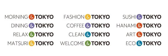
The new logo for Tokyo city was designed by ad agency Hakuhodo, under the guidance of Hakuhodo Design CEO Kazufumi Nagai, son of well-known graphic designer Kazumasa Nagai, at a cost of approximately 130 million yen (US$1.09 million). The logo is part of the Governor’s efforts to promote the nation’s capital overseas, with a number of additions to the “&TOKYO” phrase working to emphasise highlights of the city for visitors.
Netizens are concerned it might now be a case of “PLAGIARISM&TOKYO”, however, following the discovery of a similar-looking logo abroad, which, as luck would have it, is being used by a company of lawyers.
▼ To compound the problem, the distinctive ampersand is being used in a similar way by both organisations on their websites.
▼ The “&TOKYO” website features a variety of different colours, but the “&” mark still looks awfully similar.
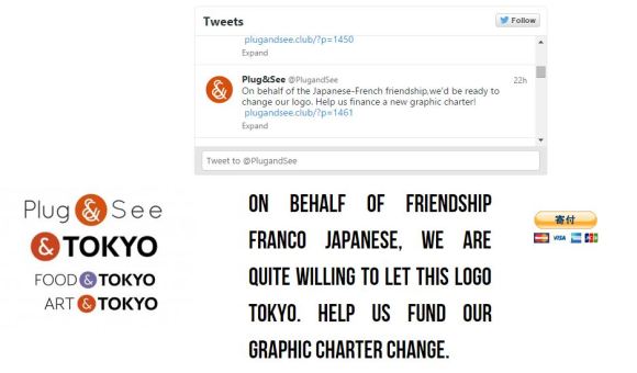
Surprisingly, this isn’t the first time the Tokyo logo has come under scrutiny, with French eyewear brand Plug&See using a similar red and white ampersand design. However, they have expressed full support, citing “the Japanese-French friendship”, for Tokyo to keep its design.
There’s been no word yet on a response from Jones & Co and at the moment it’s not known whether the company has any knowledge of the Tokyo logo. We’ll have to wait to see if New Zealand will follow suit with a similar peace branch, although admittedly, the law company logo does look markedly more similar than the one from Plug&See. Who knew a simple conjunction could cause such strife?
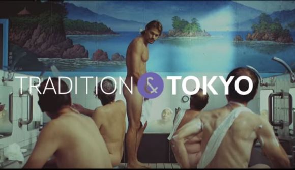
For a sneak peek at the campaign before official marketing begins on October 16, check out the three promotional videos below. Be sure to keep an eye out for a cameo from “Beat” Takeshi Kitano as a Japanese fishmonger and an appearance by artist Yayoi Kusama!
What do you think, Rocketeers? Are the people of Japan right to be concerned, or is everyone just on edge following the whole Tokyo Olympics logo debacle? After all, it’s just an ampersand in a circle…right?
Source: My Game News Flash
Top Image: &TOKYO
Insert Images: &TOKYO, Jones&Co, Plug&See, YouTube/TOKYOBRAND




 Could the 2020 Tokyo Olympics logo possibly be plagiarized?
 Looks like it’s time to say good-bye, and maybe good riddance, to the 2020 Tokyo Olympics logo
 Olympic committee expands call for logo design submissions, children and office workers welcome
 New Tokyo Olympic stadium architect responds to accusations of plagiarism
 Is there an adorably chubby bird hiding inside the Tokyo Olympics logo?
 Japan’s best conveyor belt sushi restaurant of seven years ago has now, finally, come to Tokyo
 Lawson convenience store at popular tourist site is one of the most unusual in Japan
 Japanese trains in Sapporo might be better than those in Tokyo, thanks to one special feature
 Krispy Kreme Japan giving free donuts with morning drink purchases at all branches, maybe forever
 Wisteria season starts early with blooming of Japan’s Great Wisteria in its beautiful garden
 30 Pikachus want to share a Tokyo hotel room with you that has separate Grass, Water, Fire spaces
 Mr. Sato discovers his inner beaver with a 16-inch chocolate “twig” at Tokyo Station
 Starbucks Japan releases FIVE new Frappuccinos in a day, and we try them all in 90 minutes
 Why is Yoshinoya called Yoshinoya?
 Pringles Chocolate, but with a Japanese twist, is the snack hack you should be trying right now
 Japan reportedly adding Japanese language skill requirement to most common foreigner work visa
 Mt. Fuji decorated with a 500,000-flower pink carpet is Japan’s ultimate spring view
 Pokémon and Ikea Japan cross over into each other’s worlds with collaboration events
 Starbucks Japan closing only Shinkansen platform branch for popularity-triggered renovations
 You can assemble a well-balanced team of Pokémon, them eat them, thanks to Japanese cake chain
 Man bites woman at cherry blossom park in Japan, dies shortly after
 7-Eleven Japan’s new baked-in-store sweet treat is only available in three parts of the country
 Peanuts and Coke becomes a viral hit in Japan, but is it a trend worth joining?
 Japan now has a special desk for people who work at home with a pet cat[Photos]
 Famous Tokyo cherry blossom spot installs view-blocking screens to fight overcrowding[Video]
 Uniqlo announces new T-shirts for One Piece, Naruto and more for manga publisher’s 100th birthday
 Train station platform ramen store closes its doors on half a century of history in Tokyo
 Starbucks Japan releases new My Fruit³ Frappuccino at only 34 stores around the country
 Krispy Kreme releases Super Mario doughnuts in Japan for a limited time
 Japanese onsen egg maker from 100-yen store Daiso needs to be on your shopping list
 Survey asks foreign tourists what bothered them in Japan, more than half gave same answer
 Japan’s human washing machines will go on sale to general public, demos to be held in Tokyo
 Starbucks Japan releases new drinkware and goods for Valentine’s Day
 We deeply regret going into this tunnel on our walk in the mountains of Japan
 Starbucks Japan releases new sakura goods and drinkware for cherry blossom season 2026
 Studio Ghibli releases Kodama forest spirits from Princess Mononoke to light up your home
 Japan’s newest Shinkansen has no seats…or passengers [Video]
 Major Japanese hotel chain says reservations via overseas booking sites may not be valid
 Put sesame oil in your coffee? Japanese maker says it’s the best way to start your day【Taste test】
 No more using real katana for tourism activities, Japan’s National Police Agency says
 Official 2020 Tokyo Olympic logos possess a little secret you might not have noticed
 Net user proposes clever changes to 2020 Tokyo Olympics logo in light of one-year delay
 Shibuya 109 building unveils new winning logo design set to appear over scramble crossing in 2019