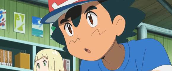
New character design has some fans in Japan hating it, others comparing it to Studio Ghibli’s artwork.
It’s only been a few days since word came that the Pokémon anime will be sending its main human character, Satoshi (or Ash, as he’s called in English territories) to school, as part of its upcoming Sun and Moon arc. There’s already a preview video for this new chapter in the animated series, but it’s causing a schism among fans in Japan.
With Satoshi having had so much screen time over the last 19 years, fans have become very acquainted with his character design. Because of that, many were quick to notice that he’s being drawn in a significantly different way in the Sun and Moon preview, with softer, rounder lines to his facial features, physique, and even hair than in previous anime installments.
To further illustrate the contrast, one Japanese Twitter user posted a comparison showing Satoshi’s original animated design in the upper left, and the character’s Sun and Moon version at the bottom right.
▼ With its first episodes airing in 1997, Pokémon was born in an area of much more angular anime aesthetics.
絵の表現はちょっとづつ変化していても、
— 🌈✨松本梨香✨🌈 (@rica_matsumoto3) September 15, 2016
サトシの魂は変わらないょ。
いろんなサトシを楽しんで♪
(*☻-☻*)
梨香自身も驚いたりしたけど
サトシへの愛はかわらない…
これからも全力でみんなに愛されるサトシを演じます!! pic.twitter.com/aTEocyrIvu
Traditionalists have already begun clamoring for animators to give them back the old Satoshi, calling his new appearance dorky and childish-looking. That latter quality, though, might very well be intentional. While he’s always ostensibly been 10-years-old, Satoshi has acted with the independence of an adult for most of the Pokémon anime, traveling the world without any sort of adult supervision on his quest to become a Pokémon Master. By putting him in a school setting, Sun and Moon has to acknowledge the division between adults and children in Satoshi’s world, and a softer design that communicates he isn’t a grown-up makes sense for that context.
It’s not like everyone is hating the new look, either. Some have defended it on the grounds that with its events taking place on a chain of tropical islands, a softer look is totally appropriate for Sun and Moon. Even the color palette seems to have been influenced by this. Watching the video, you’ll see plenty of single-hued coloring that gives the scenes a sun-bleached look, somewhat reminiscent of certain portions of director Mamoru Hosoda’s anime film The Boy and the Beast.
As a matter of fact, the apparent willingness of Sun and Moon’s animation to squash or stretch its characters has some online saying it reminds them not only of Hosoda’s work, but of Studio Ghibli’s, too.
Pokémon Sun and Moon is set to premiere this November on TV Tokyo.
Source: IT Media
Images: YouTube/ポケモン公式YouTubeチャンネル
Follow Casey on Twitter, where he’s pretty much onboard with Sun and Moon as long as Pikachu is still cute.




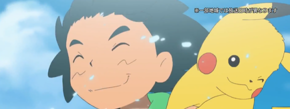
 Ash has totally let himself go in the Pokémon Sun and Moon anime
 Ash is going to look very different (again) in the new Pokémon anime movie【Video】
 Pokémon’s Ash FINALLY wins a Pokémon tournament championship!
 Japan reportedly adding Japanese language skill requirement to most common foreigner work visa
 7-Eleven Japan’s new baked-in-store sweet treat is only available in three parts of the country
 Starbucks Japan closing only Shinkansen platform branch for popularity-triggered renovations
 McDonald’s Japan adds new Hello Kitty and Pompompurin drinks to the menu for a limited time
 A Kyoto factory vending machine sells gourmet mystery meals at bargain prices
 Two food hacks take Japan’s convenience store fried chicken to amazing new sandwich heights
 Free Wi-Fi is coming to Mt. Fuji this summer
 Tokyo turns its phone booths into free Wi-Fi hotspots, and here’s how to use them
 Oodles of noodles! Udon chain pays homage to all 47 prefectures of Japan with 47 dishes【Photos】
 Is Tokyo’s ultra-expensive Satsuki sweet bean bread worth it?【Taste test】
 Pokémon and Ikea Japan cross over into each other’s worlds with collaboration events
 Tokyo’s best museum for foreign travelers finally reopens after being closed for four years
 Pokémon lacquerware series expands for Year of the Horse with new handcrafted design[Video]
 Tokyo subway and almost all Tokyo train lines now accepting credit card tap payments
 Totoro Fund line of beautiful artwork and apparel lets you help the real-world Totoro Forest
 Fading Tokyo – Searching for signs of the Showa era as local neighborhoods evolve[Photos]
 Famous Tokyo cherry blossom spot installs view-blocking screens to fight overcrowding[Video]
 Studio Ghibli adds new My Neighbour Totoro 2026 Corn Gift to its anime store for Mother’s Day
 Japan now has a special desk for people who work at home with a pet cat[Photos]
 Uniqlo announces new T-shirts for One Piece, Naruto and more for manga publisher’s 100th birthday
 Train station platform ramen store closes its doors on half a century of history in Tokyo
 Starbucks Japan releases new My Fruit³ Frappuccino at only 34 stores around the country
 Studio Ghibli releases Catbus pullback keychain that runs like the anime character
 Krispy Kreme releases Super Mario doughnuts in Japan for a limited time
 Japanese onsen egg maker from 100-yen store Daiso needs to be on your shopping list
 Nine great places to see spring flowers in Japan, as chosen by travelers (with almost no sakura)
 Survey asks foreign tourists what bothered them in Japan, more than half gave same answer
 Japan’s human washing machines will go on sale to general public, demos to be held in Tokyo
 Starbucks Japan releases new drinkware and goods for Valentine’s Day
 We deeply regret going into this tunnel on our walk in the mountains of Japan
 Studio Ghibli releases Kodama forest spirits from Princess Mononoke to light up your home
 Starbucks Japan releases new sakura goods and drinkware for cherry blossom season 2026
 Japan’s newest Shinkansen has no seats…or passengers [Video]
 Major Japanese hotel chain says reservations via overseas booking sites may not be valid
 Put sesame oil in your coffee? Japanese maker says it’s the best way to start your day【Taste test】
 No more using real katana for tourism activities, Japan’s National Police Agency says
 Not just Ash – New Pokémon anime reveals it will have two protagonists【Video】
 Special Ash cap Pikachu added to Pokémon GO for game’s first-birthday celebration
 Ash and Pikachu are stepping down as the main characters of the Pokémon anime【Video】
 Old-school Pokémon Champions Red and Blue return in latest new Pokémon Sun & Moon trailer 【Video】
 New starter Pokémon and setting for upcoming Pokémon Sun and Moon games revealed 【Video】
 Ash’s Japanese voice actress nails Pokémon anime theme one last time before retiring from role【Vid】
 New Pokémon games coming to Nintendo Switch and 3DS this fall!【Videos】
 Satoshi/Ash’s voice actress almost couldn’t make it through final Pokémon anime recording session
 New Pikachu character coming to Pokémon anime series after Ash’s retirement
 New Pokémon Mimikyu gets social media campaign, official song to help it make friends 【Video】
 Resellers storm Pokémon Centers in Japan to get their hands on new Lillie merchandise
 A couple of costumed Pokémon are the newest additions to Pokémon Sun and Moon!
 Nintendo unveils two new limited-edition Pokémon 3DS units, and true fans will want both 【Photos】