
Unnecessary revamping of graphics leads some to view it as a case of anime-ization gone too far.
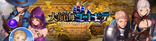
Golden Voyage Age, or Daikoukai Utopia (“Great Voyage Utopia”) in Japanese, is a mobile phone action RPG released in Japan on November 29 by publisher BBGame (with development by China’s NetEase Games). The game sets your playable character as a seafarer charged with the remodeling and battling of ships, conducting of trade, and exploration of ruins in Europe during the Age of Exploration (roughly the 15th-18th centuries).
Such a spirit of adventure calls for some equally enthralling visuals, which the development team teased in pre-release introductory video clips of the game such as the following:
However, just two days before the game’s eventual Japanese release, Golden Voyage Age’s official Japanese-language Twitter account posted the following announcement that they were in the midst of tweaking the character art.
【大航海ユートピアのゲーム内グラフィックについて】
— 大航海ユートピア【公式】 (@daitopi) November 28, 2018
今後、大航海ユートピアは日本向けにグラフィックを差し替えていく予定です!
イラストは「チーズパン @dhl1992113 」さんをメインに描いていただいており、
既に40名程のキャラは、立ち絵の差し替えが完了しております。 pic.twitter.com/FqijyG7qhs
“We are planning to change the game’s graphics to better meet the tastes of Japanese players! The new illustrations will be done primarily by @dhl1992113. He has already completed approximately 40 character still images.”
That’s good and all…but was it really necessary to spend the time and resources to effect such a change? The side-by-side comparisons of the original character design (above left) versus the revamped design (above right) both have their merits, but the revised version definitely draws its inspiration from moe anime-style artwork–which ultimately left a bad taste in some net users’ mouths.
The account posted a follow-up message shortly after announcing the artwork change, saying:
“We are aiming to illustrate the remaining characters’ images with the utmost quality as well, so replacing them may take a little more time. Please look forward to the finished work. There will be several updates after the game is released, so please expect great things from this game!”
▼ A few more examples of the game’s new “Japan-oriented” character art, as seen on the game’s official Japanese Twitter account.
On the whole, net users reacted negatively to the artwork change:
“The original images are of a higher quality.”
“The former illustrations are better suited to the atmosphere of the European Age of Exploration, and I happen to like them better personally. Please don’t simply assume that all Japanese people are into the moe-look.”“This is a ‘Great Disappointment.'”“I laughed, and then I laughed again when I saw the difference in the boobs.”
“They both have their merits. It would be great if users could choose which style they wanted.”
One net user even poked fun at the obvious marketing tactic with a humorous “Japanizing” meme:
https://twitter.com/antikris77/status/1067920359628947457Regardless of which style you prefer, the game can be downloaded for both Android or iPhone in Japanese via its official Japanese site. Happy sailing!
Source: Twitter/@daitopi via Itai News
Featured image: Twitter/@daitopi
Insert image: Twitter/@daitopi
 Japanese net users marvel at the evolution of The Idolmaster’s graphics over the past 10 years
 Three new starter Pokémon Jets to fly in Japan, first begins carrying passengers this month
 Uniqlo looks back to the very start of Pokémon with new black-and-white pixel art T-shirts[Pics]
 Family Mart opens new “Famima” flagship store in Tokyo that’s like a tourist attraction
 Studio Ghibli has a new anime out, and there’s only one place in the world where you can see it
 Japan reacts to Donald Trump’s “Islamic Republic of Japan” remark
 Solid gold Hedorah kaiju from the Godzilla series is now available to pre-order
 Family Mart changes its Famichiki packaging for the first time in nine years
 Studio Ghibli theme park’s new dessert is a drinkable version of Hayao Miyazaki’s pilot daydream
 Furby is now a sexy anime girl figure[Photos]
 Survey shows foreigners’ desire to work in Japan long-term dropping, but that’s not the whole story
 Salomon releases Japan-exclusive Mt. Fuji hiking gear that doubles as an amazing souvenir
 A visit to Sri Lanka’s knockoff knockoff Uniqlo (no, we didn’t stutter) to see its rare “Pikachus”
 Japanese airport rebrands itself as “Sushi Airport” to attract foreign tourists
 Japan triples departure tax, foreign tourists and locals now must pay more to leave country
 New Mt. Fuji overnight bus takes travelers from downtown Tokyo straight to the most popular hiking trail
 Don’t judge this Kiki’s Delivery Service book by its cover, because it’s not actually a book!
 Japan announces sudden 400-percent increase in visa fees for foreigners entering the country
 Japanese ninja certification exam attracts 131 candidates from Japan and abroad
 Studio Ghibli store Donguri Republic announces opening of first-ever store in America
 New Japanese overnight train coming to connect Tokyo with Tohoku in sleep-travel style
 Japanese sweets shop sells an ohagi so exquisite it sells out by noon
 Sanrio Character Poll announces winners, Hello Kitty absent from top 10 in many countries
 Japan’s human washing machines will go on sale to general public, demos to be held in Tokyo
 Starbucks Japan releases new drinkware and goods for Valentine’s Day
 Starbucks Japan releases new sakura goods and drinkware for cherry blossom season 2026
 Japan’s newest Shinkansen has no seats…or passengers [Video]
 Put sesame oil in your coffee? Japanese maker says it’s the best way to start your day【Taste test】
 Japan reportedly adding Japanese language skill requirement to most common foreigner work visa