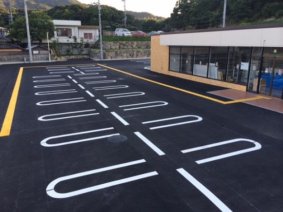
One thing that has always stood out about Japan for me personally is the sidewalks. No matter where you are, you’ll almost always have a little yellow brick road to skip along–though it’s not actually an ode to The Wizard of Oz. In fact, it’s not an ode to anything at all: Those yellow, bumpy tiles are actually guides for the visually impaired. It’s a simple but clever solution–you can easily feel the bumps even through your shoes and they’re even easier to find with a cane. That way, even if you can’t see, you can still be sure you’re walking safely on the sidewalk and know when you’re coming to a turn or crossing.
Well, unless you’re trying to get to this newly built convenience store…
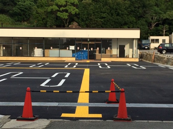
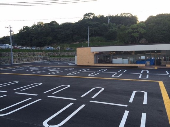
Taken at what looks like a newly constructed convenience store somewhere in rural Japan, these photos show just how important it is to plan ahead. As you can see, someone clearly forgot to install the yellow guide tiles for blind citizens before laying out the park spaces.
▼”Umm…well, everyone likes mazes, right?”
Now, there are two possibilities that we can think of here: On one hand, maybe no one realized what had happened until after they were done painting and figured it was easier to install a ton of tiles than it was to repaint. On the other hand, maybe someone knew exactly what they were doing–why else would they have so freaking many of the little yellow tiles lying around?
▼”Well, we got them on sale at Costco…”
Either way, this clearly is the worst possible path to take to the front door–you’d be literally walking directly in the path of traffic. You’d almost be safer just throwing your hands in the air and running around in circles on a freeway.
▼”Parking lot to the daaaaaaaaaaanger zone!”
We think you’ll agree that, however grateful visually impaired people may be for the tiles’ presence outside the combini, this is some pretty horrible planning. Hopefully anyone who actually need the tiles for navigation will have someone around to point them in a direction that doesn’t take them right through a car lane!
Japanese Internet users were as baffled as we were.
“It’s kind of like a gauntlet, I guess…”
“Someone needs to call a human rights group…”
“Is this really the obviously solution to avoiding places where cars would be?”
“Jeez, just give up on one parking space!!”
“Well, I guess it’s barrier free…”
“Aren’t there usually no guide tiles in the parking lot??”
“Yeah, I don’t think I’ve ever seen them before…”
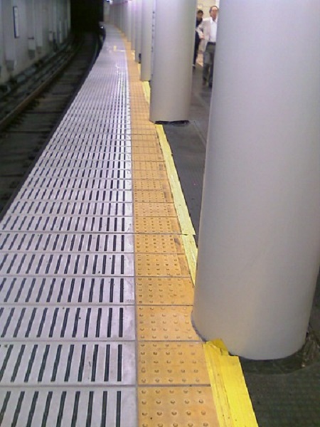
Another Japanese commenter actually had some useful information: The tiles with straight lines are guide tiles–in other words, those are the ones to follow. The tiles with lots of “dots” are caution tiles–they tell you where not to go. Unfortunately, the people laying out the tiles can’t always predict the future, which leads to things like this…
▼Maybe it’s for Mario?
…or this…
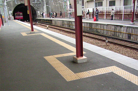
▼Note that these are the dotted tiles, so they’re there just keep people from falling on the tracks.
Or this! Actually, we’re not sure about this one, since, again, these are the dotted tiles, which are meant to let people know where not to go. Then again, we really want to know why they’re trying to keep blind people away from the poles…have they been painted recently?!
▼Maybe that’s where they hide the candy!
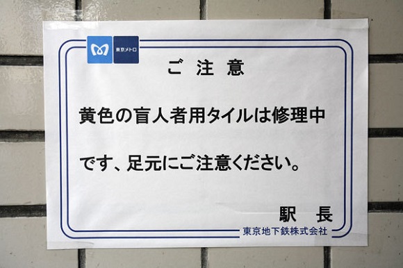
And then there’s this. In principle, we guess we have to give the station staff credit for trying to be helpful…but they probably should have put a bit more thought into this sign. It reads: “CAUTION! The yellow tiles for blind people are being repaired, so please be careful where you walk. Station Manager”
▼It’s the thought that counts, right?
Obviously, you could argue, fairly enough, that the sign is less for blind people themselves and more to call attention to the issue so others can help out…though we have a hard time believing that this is anything but more poor planning.
Though, in their defense, at least the people following this route don’t have to chant a magical incantation to get to their destination safely…
Sources/images: Hamusoku


 Japanese survey reveals over 60 percent of blind people with guide dogs get turned away by shops
 Man parks over sidewalk guide for the blind, gets lesson in manners from Okinawan fourth-grader
 Smartphone remorse – Commuting with a blindfold to better understand blind pedestrians’ plight
 Blind Japanese boy sends Nintendo heartwarming thank you letter, gets amazing response
 Before anyone freaks out, no, Kirby isn’t human
 Japan now has a “for foreign tourists only” Mt. Fuji sightseeing train[Video]
 7-Eleven Japan releases a crazy new viral sandwich: Chocolate Sprinkles and Whipped Cream
 Public restrooms in Osaka to get in-stall video screens with ads
 Ghibli Museum building becomes a cuddly cushion
 Studio Ghibli releases the My Neighbour Totoro tea caddy, with a magical self-closing lid
 Why you should be adding Calpis to your beer in Japan
 Fake police phone scam also highlights dumb stereotype about how foreigners speak Japanese[Video]
 Here’s what you need to know before the 2026 Sanrio Character Ranking voting goes live
 Create a tiny Ghibli anime world on your bookshelf with new miniature papercraft art kits
 Legendary pie shop Anna Miller’s is returning to Tokyo, bringing iconic waitress uniforms with it
 Starbucks Japan releases new My Fruit³ Frappuccino at only 34 stores around the country
 Japanese onsen egg maker from 100-yen store Daiso needs to be on your shopping list
 Cherry blossoms begin blooming in Japan with record-early starts for sakura season
 Tokyo government organizes food truck event to clear out delinquent/homeless teen gathering area
 Nine amazing off-the-beaten-path cherry blossom spots in Japan for yaezakura and shidarezakura
 Stunning central Japan wisteria festival is like a purple fantasy straight out of a Ghibli movie
 When will the cherry blossoms reach full bloom in Japan this year?[Forecast]
 Studio Ghibli unveils new Rollbahn notebook in honour of Howl’s Moving Castle
 Studio Ghibli adds new anime tumblers to its cool streetwear brand in Japan
 Universal Studios’ Sailor Moon theme park attraction is finally coming to America
 Starbucks Japan unveils new sakura cherry blossom collection for hanami season 2026
 Train station platform ramen store closes its doors on half a century of history in Tokyo
 Studio Ghibli releases Catbus pullback keychain that runs like the anime character
 Nine great places to see spring flowers in Japan, as chosen by travelers (with almost no sakura)
 Starbucks Japan releases first-ever Hinamatsuri Girls’ Day Frappuccino
 Studio Ghibli adds new Mother’s Day gift sets to its anime collection in Japan
 Virtual idol Hatsune Miku redesigned with look that adds new elements and brings back old ones
 Survey asks foreign tourists what bothered them in Japan, more than half gave same answer
 Japan’s human washing machines will go on sale to general public, demos to be held in Tokyo
 Starbucks Japan releases new drinkware and goods for Valentine’s Day
 We deeply regret going into this tunnel on our walk in the mountains of Japan
 Studio Ghibli releases Kodama forest spirits from Princess Mononoke to light up your home
 Starbucks Japan releases new sakura goods and drinkware for cherry blossom season 2026
 Japan’s newest Shinkansen has no seats…or passengers [Video]
 Major Japanese hotel chain says reservations via overseas booking sites may not be valid
 Put sesame oil in your coffee? Japanese maker says it’s the best way to start your day【Taste test】
 No more using real katana for tourism activities, Japan’s National Police Agency says
 Starbucks in traditional Japanese building at Ise Jingu has hidden secrets in its roof tiles
 Can our reporters tell fancy specialty store camembert cheese from the convenience store stuff?
 The Japanese dog cafe that isn’t technically a dog cafe
 Starbucks Japan releases new Pumpkin Spice Latte chilled cup exclusively at convenience stores
 Yahoo! Japan’s “50%-off” campaign isn’t quite what it seems
 Japanese people list their top ten fish, and tuna isn’t number one
 A case of culture shock: Japanese summer vacation isn’t much of a vacation at all
 “Don’t touch my moustache!” Japanese that sounds like English but isn’t, and vice versa!
 Can you spot the hidden cats at this Tokyo train station?
 Japanese toilet sweets put a new twist on tradition
 Shimonoseki’s Koreantown isn’t like Tokyo’s or Osaka’s, but it has a retro atmosphere all its own
 New hot natural spring water at 7-Eleven proves Japanese convenience stores really are convenient
 Junior high kid has lucky escape, learns why walking while using a smartphone isn’t a good idea
 7-Eleven opens “next generation” SIP convenience store in Japan