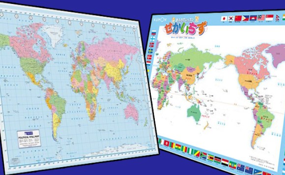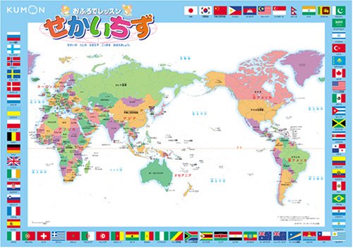
Depending on what part of the world you live in, one of these maps will look right at home while the other might seem kind of off. However, given the overall dominance of the Euro-centric map, the other one is more likely to give an uncomfortable feeling to a greater number of people.
While both are currently in use in different countries, is it possible that one map is more valid than another?
A discussion broke out on the international imageboard 4chan over Pacific-centric maps. Although it was misguidedly introduced as only a “Japanese-made map” surprisingly a fair number of people from various countries came to its defense.
USA: Japanese people use a world map with Japan in the center… What do you think about that?
Canada: Holy crap! Look at all that wasted space in the middle where the Pacific Ocean is.
Italy: It makes more sense than I expected.
France: It “makes sense” that Greenland is split into two?
Finland: Good luck finding anyone who’ll care that Greenland is split.
Argentina: It is useful, putting your own country in the center of the map.
USA: Silly Japanese, don’t they know America is the center of the world?
UK: It’s actually kind of cool. You can better see how homo sapiens evolved and spread across the world from left to right.
Italy: Seeing Italy on the outer parts of the world gives me a strange feeling…
Australia: Australian people use the same map.
Thanks to the comment out of Australia we could see that this map is not exclusive to Japan but to other countries in the Eastern part of Asia as well.
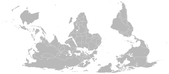
And while we’re on the topic of Australia, I have an open request for the whole continent: Would you please stop telling Japanese tourists that you use a version of the world map with Australia on top? I have met a surprising number of people in Japan who are fully convinced everyone in Australia uses a south-up map.
Anyway, the Pacific-centered map certainly has some benefits in terms of anthropology. It also disrupts the barren tundra of Greenland instead of the numerous populated islands of the Pacific. It’s also more in keeping with the tectonic plates.
On the other hand, the Euro/Afro-centric map has the benefit of being more in line with the time zones. In addition, straying from it would screw-up various common English terms. North and South America would become the Far East and the Middle East would become the Mid-West.
In the end though, it doesn’t really matter as the boundaries of maps are completely arbitrary on a round world. And with the advent of geographic information systems like Google Maps the world can look any way you want it to at any time.
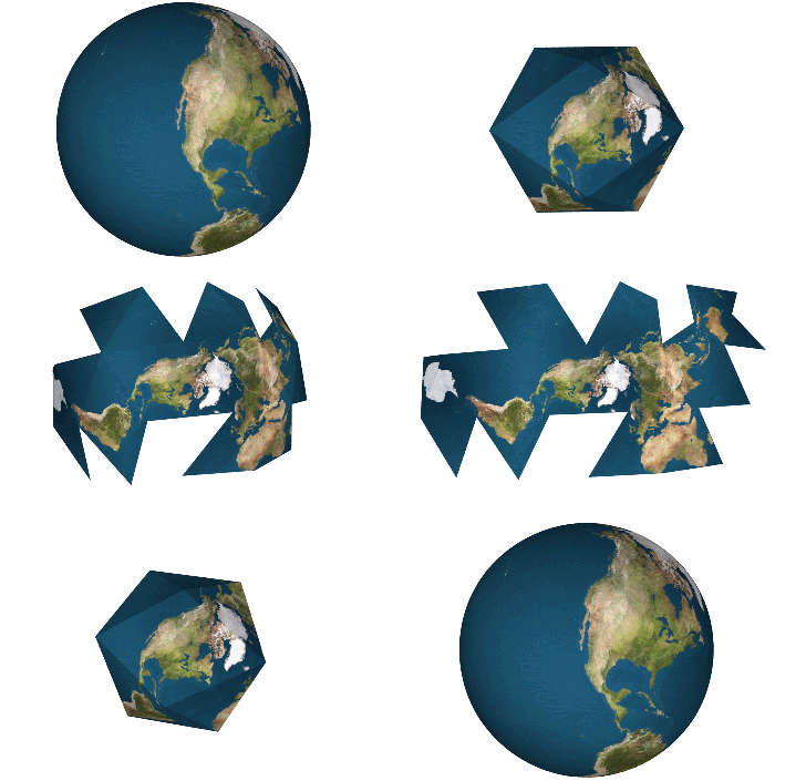
Not to mention that Mercator projection maps are for third-graders and USA Today infographics. If you want a truly distortion-free look at the Earth in 2-D, go Dymaxion map or go home.
Source: Kaigai No Bankoku Hannoki (Japanese)
World Maps: Amazon – 1, 2
South-up map: Wikipedia – CaseyPenk
Dymaxion map: Wikipedia – Chris Rywalt


 One man’s epic journey around the world… on a unicycle
 Japanese Guy Follows Dream of Travelling World and Taking Pictures of Beautiful Women (But Needs Our Help)
 Ranking of Taxi Fares Around the World – Japanese Passengers Getting Hosed, Even More So Next Year
 Which 15 countries have the least violent armed forces in the world?
 Mt. Fuji decorated with a 500,000-flower pink carpet is Japan’s ultimate spring view
 30 Pikachus want to share a Tokyo hotel room with you that has separate Grass, Water, Fire spaces
 Drink vending machines disappearing in Japan as number drops to lowest in 30 years
 Krispy Kreme Japan giving free donuts with morning drink purchases at all branches, maybe forever
 Creator of Rurouni Kenshin anime/manga admits to possession of child pornography
 Japanese politician arrested on charges of accepting bribes to reduce number of monkeys in park
 Step into Japanese culture with Converse’s new Japan-exclusive shoes featuring gods, sushi style
 McDonald’s and Gundam team up for customized anime mecha and fried chicken sandwiches[Video]
 Make your junk food more wholesome with homemade no-fry Jagarico croquettes【SoraKitchen】
 Japanese Scottish Fold Motimaru grabs Guinness World Record for most watched cat on YouTube
 Japan reportedly adding Japanese language skill requirement to most common foreigner work visa
 Pokémon and Ikea Japan cross over into each other’s worlds with collaboration events
 Starbucks Japan closing only Shinkansen platform branch for popularity-triggered renovations
 You can assemble a well-balanced team of Pokémon, them eat them, thanks to Japanese cake chain
 Two food hacks take Japan’s convenience store fried chicken to amazing new sandwich heights
 7-Eleven Japan’s new baked-in-store sweet treat is only available in three parts of the country
 Man bites woman at cherry blossom park in Japan, dies shortly after
 Peanuts and Coke becomes a viral hit in Japan, but is it a trend worth joining?
 Can a downtown Tokyo super sento bathhouse beat a hotel for a one-night stay?
 New Japanese KitKats come in sakura flavour, with poetic symbolism for success
 Japan now has a special desk for people who work at home with a pet cat[Photos]
 Famous Tokyo cherry blossom spot installs view-blocking screens to fight overcrowding[Video]
 Uniqlo announces new T-shirts for One Piece, Naruto and more for manga publisher’s 100th birthday
 Train station platform ramen store closes its doors on half a century of history in Tokyo
 Starbucks Japan releases new My Fruit³ Frappuccino at only 34 stores around the country
 Krispy Kreme releases Super Mario doughnuts in Japan for a limited time
 Studio Ghibli releases Catbus pullback keychain that runs like the anime character
 Japanese onsen egg maker from 100-yen store Daiso needs to be on your shopping list
 Survey asks foreign tourists what bothered them in Japan, more than half gave same answer
 Japan’s human washing machines will go on sale to general public, demos to be held in Tokyo
 Starbucks Japan releases new drinkware and goods for Valentine’s Day
 We deeply regret going into this tunnel on our walk in the mountains of Japan
 Starbucks Japan releases new sakura goods and drinkware for cherry blossom season 2026
 Studio Ghibli releases Kodama forest spirits from Princess Mononoke to light up your home
 Japan’s newest Shinkansen has no seats…or passengers [Video]
 Major Japanese hotel chain says reservations via overseas booking sites may not be valid
 Put sesame oil in your coffee? Japanese maker says it’s the best way to start your day【Taste test】
 No more using real katana for tourism activities, Japan’s National Police Agency says
 Shikoku Island holds world landmark lookalike photography contest judged by AI
 Around the world in 22 upside-down houses 【Photos】