We’d like to add our own stamp of approval to the ones already there.
Read More
logo
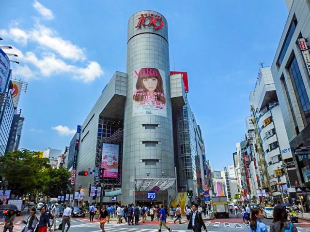
Owners say sayonara to their iconic red sign with a new logo that captures the spirit of all the youth fashion stores inside the building.
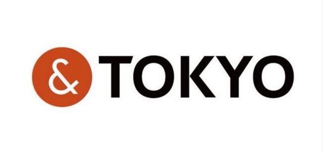
Tokyo Governor Yoichi Masuzoe revealed the capital city’s new logo at a press conference in the nation’s capital on Friday, and the simple design, featuring the one-line catchphrase “&TOKYO”, is already in the spotlight for all the wrong reasons.
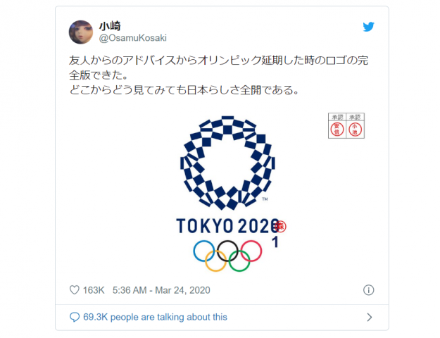
The logo unveiling was met with a heightened level of scrutiny following the plagiarism scandal which resulted in the withdrawal of the official Tokyo 2020 Olympics logo recently, and it turns out that netizens are now worried about a recurrence of events. The distinctive white ampersand enclosed in a circle has been discovered online in a similar black, white and red configuration currently in use by another organisation, an insurance and commercial litigation company in New Zealand.
There hasn’t been a lot of love for the 2020 Tokyo Olympics’ logo, which was officially unveiled by the event’s Organising Committee at the tail-end of July. Almost immediately after getting their first eyeful of it, many in Japan called it unappealing and confusing, and just a few days later some were calling it plagiarized.
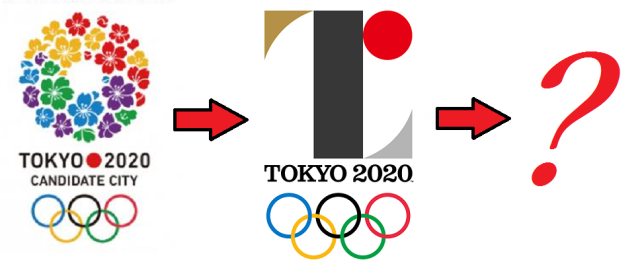
In other words, not too many people were looking forward to seeing the emblem plastered all over the city during the Games, as well as the years leading up to them. The good news for the logo’s detractors is that they probably won’t have to, as the organizers of the Tokyo Olympics seem ready to officially withdraw the design for their promotion.
It’s been a rocky debut for the 2020 Tokyo Olympics official logo. First, it elicited mixed reactions as to whether its somewhat obtuse aesthetics really conveyed the noble sentiments it was aiming for. Then came the allegations that the logo was plagiarized from the emblem of a Belgian theater.
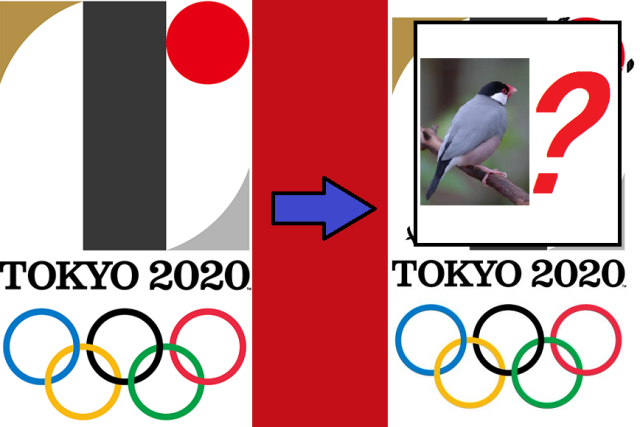
But let’s set aside the issue of whether or not the design is a copy or not and ask another artistic question: Is the Tokyo Olympics logo actually an adorably stylized bird?
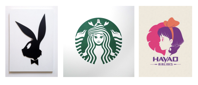
San Francisco design agency Pictogram has reimagined several Pokemon as corporate logos, joking that “since the Pokémon Corporate Personhood Act of 2015, as spearheaded by Professor OAK, Pokémon became free to start their own companies, mandating the design of Pokémon brand identities.”
Here are some of our favorites:
It’s the ultimate easter egg, the key to secret funny effects on all kinds of websites. The konami code, entered by pressing the sequence up-up-down-down-left-right-left-right-B-A, works on Twitter!
The code, which originated in video games from Japanese publisher Konami, and is called the konami komando (“konami command”) in Japanese. Twitter user @konosuke recently posted that, perusing the site’s JavaScript, he had discovered a piece of code in there that read “konami_watcher”. Intrigued, he punched in the magic code on Twitter’s timeline page and … something surprising happened! Join us after the jump for a look at Twitter’s new flippy bird!
For a country that allegedly has little contact with the outside world, North Korea somehow manages to end up in the news an awful lot. While it’s hard to tell how much of what we hear and read is true, sometimes a nugget of truth–beautiful, hilarious truth–slips through the cracks of propaganda on both sides of the ideological line and leaves us giggling.
As you’ve probably heard, the Democratic People’s Republic of Korea (DPRK) has recently unveiled the logo for their year-old space agency, NADA. Though they may have expected fanfare or at least a bit of grudging respect, the main response they got was an Internet full of giggles.
Today the marketing industry is a multi-billion dollar entity that spends countless man-hours designing and maintaining relatable brand logos. That’s why the work of pop-culture artist, Bruce Yan, is so cool. He takes characters we all know and love and uses them to recreate logos we see every day, somehow managing to give rise to a brand new and yet completely familiar logo. From the Girl Scout symbol to Morton Salt, take a look at his clever redesigns after the jump!


 Japan now has a special desk for people who work at home with a pet cat[Photos]
 Famous Tokyo cherry blossom spot installs view-blocking screens to fight overcrowding[Video]
 Uniqlo announces new T-shirts for One Piece, Naruto and more for manga publisher’s 100th birthday
 Rumors say this is Japan’s very best McDonald’s branch, but what makes it special?[Taste test]
 Starbucks Japan adds new Sencha Matcha Tea Frappuccino to its menu, but only at 28 locations
 Krispy Kreme releases Super Mario doughnuts in Japan for a limited time
 Restaurant Yoshibei is crazy in the best way: A pork cutlet set with a side of pork cutlet bowl
 The Times They are a-Changin’: Our reporter reflects on the changing landscape of Ebisu
 Public restrooms in Osaka to get in-stall video screens with ads
 Tokyo’s amazing 2D Cafe looks like an illustration, but it’s an actual restaurant you can eat in!
 7-Eleven Japan releases a crazy new viral sandwich: Chocolate Sprinkles and Whipped Cream
 Japan now has a “for foreign tourists only” Mt. Fuji sightseeing train[Video]
 Starbucks Japan releases new My Fruit³ Frappuccino at only 34 stores around the country
 Studio Ghibli releases the My Neighbour Totoro tea caddy, with a magical self-closing lid
 Create a tiny Ghibli anime world on your bookshelf with new miniature papercraft art kits
 Stunning central Japan wisteria festival is like a purple fantasy straight out of a Ghibli movie
 Starbucks Japan unveils new sakura cherry blossom collection for hanami season 2026
 Train station platform ramen store closes its doors on half a century of history in Tokyo
 Studio Ghibli releases Catbus pullback keychain that runs like the anime character
 Japanese onsen egg maker from 100-yen store Daiso needs to be on your shopping list
 Nine great places to see spring flowers in Japan, as chosen by travelers (with almost no sakura)
 Cherry blossoms begin blooming in Japan with record-early starts for sakura season
 Survey asks foreign tourists what bothered them in Japan, more than half gave same answer
 Japan’s human washing machines will go on sale to general public, demos to be held in Tokyo
 Starbucks Japan releases new drinkware and goods for Valentine’s Day
 We deeply regret going into this tunnel on our walk in the mountains of Japan
 Studio Ghibli releases Kodama forest spirits from Princess Mononoke to light up your home
 Starbucks Japan releases new sakura goods and drinkware for cherry blossom season 2026
 Japan’s newest Shinkansen has no seats…or passengers [Video]
 Major Japanese hotel chain says reservations via overseas booking sites may not be valid
 Put sesame oil in your coffee? Japanese maker says it’s the best way to start your day【Taste test】
 No more using real katana for tourism activities, Japan’s National Police Agency says
 Krispy Kreme releases Super Mario doughnuts in Japan for a limited time
 Restaurant Yoshibei is crazy in the best way: A pork cutlet set with a side of pork cutlet bowl
 The Times They are a-Changin’: Our reporter reflects on the changing landscape of Ebisu
 Public restrooms in Osaka to get in-stall video screens with ads
 Tokyo’s amazing 2D Cafe looks like an illustration, but it’s an actual restaurant you can eat in!
 This upcycled Kyoto train cafe is the ultimate kawaii spring experience
 Fatal stabbing at Pokémon Center in Tokyo reignites concern over rising stalking cases in Japan
 This Japanese vending machine doesn’t sell drinks, but you can buy drinks through it
 Fake police phone scam also highlights dumb stereotype about how foreigners speak Japanese[Video]
 All-you-can drink deal in Japan puts the self-serve drinks machine right on your table
 Starbucks Japan has a new Frappuccino on the menu, but does it really taste like a cream puff?
 Tokyo Disney will give New Year’s Eve visitors the chance to party for 26 straight hours!
 Final Fantasy invites you to adventure in Fukushima with Fukushima Fantasy Chocobo fun[Video]
 This Japanese pub with one-yen bottles of sake broke our brain and made our day