Written Japanese uses three kinds of script. At the top of the difficulty curve, you’ve got kanji, the complex characters originally imported from China that can require over a dozen brush strokes to write, with each kanji representing a word or concept.
A little less challenging are hiragana, a set of 50 curving phonetic characters, but if English is your native language, odds are you’ll have the least trouble with angular katakana. Like hiragana, katakana is a phonetic system, so each character corresponds to a syllable. Even better, while often one kanji can have three or four possible readings, each katakana has just one possible pronunciation.
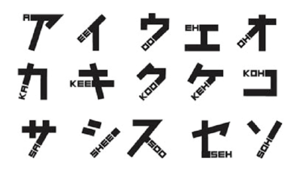
Of course, you still have to memorize how to pronounce all 50 katakana (85 if you’re being really technical) in the first place. One group of graphic designers are aiming to make that task a little easier, though, with a font that combines katakana with phonetics written in English.
Employees of U.K.-design house Johnson Banks often come to Japan to work with clients. Japanese is a tricky language to learn, though, and even after multiple trips to the country, the business travelers weren’t going to just naturally pick up the ability to read katakana.
It’s not too surprising that professional designers are visually oriented people, and so Johnson Banks spent several months developing a new font where an English rendering of each katakana’s sound replaces a brush stroke in whole or part.
For example, here’s the name of Uniqlo, beloved outfitter of exchange students and Internet writers, as it looks in katakana.
And here it is rendered in Johnson Banks’ new Phonetikana font.
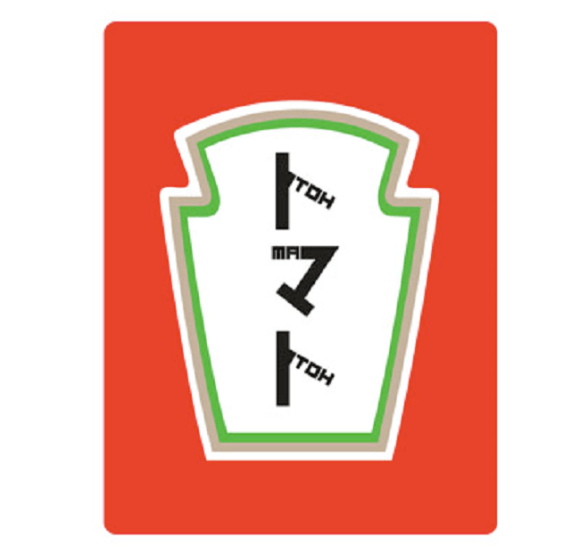
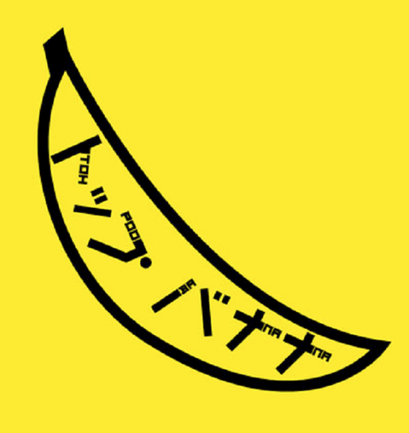
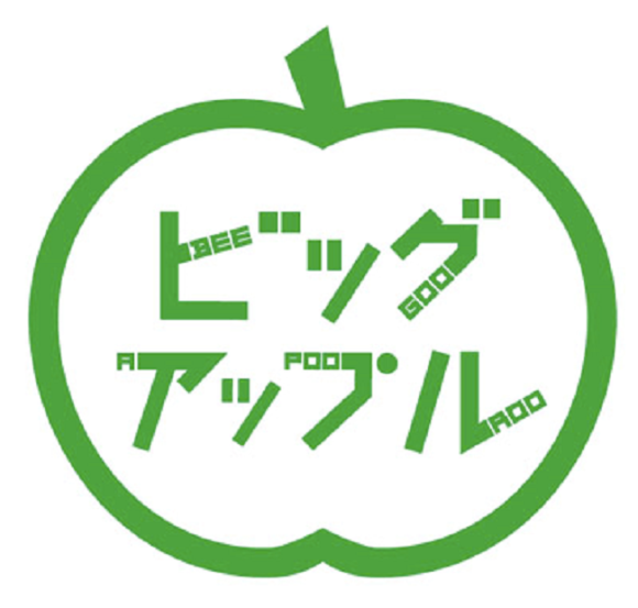
Katakana is primarily used for foreign loanwords, and we can see a few more artistic flourishes in these designs that the company drew up, possibly before lunch.
▼ tomato/tomato
▼ toppu banana/top banana
▼ biggu appuru/big apple
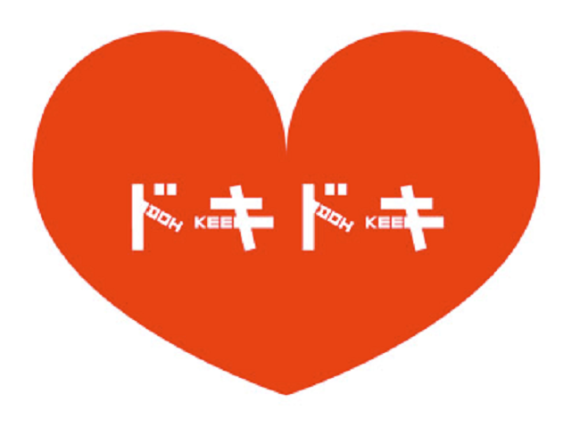
Aside from words of foreign origin, katakana is also often the go-to choice when writing sound effects, onomatopoeia, and comic book-style action words, such as doki doki, the sound of an excited heartbeat…
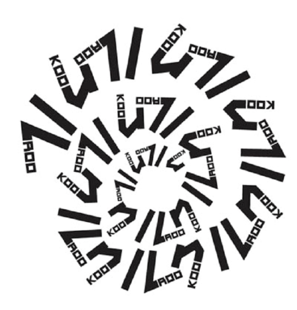
…kuru kuru, spinning or spiraling…
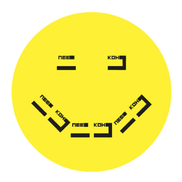
…or niko niko, indicating that someone is all smiles.
In a way, this linguistic mashup is a really clever idea, and with a few tweaks, it might actually be an easy way for brand new learners to dip their toes in Japan’s deep linguistic waters. What kind of tweaks? Well, let’s take another look at niko niko.
Notice how we’re spelling it differently than Johnson Banks does?
It’s true that there are a couple of different systems for writing Japanese words in the Latin alphabet, but there’s one method that’s by far the most common, and it says the Japanese syllable that sounds like the English word “knee” should be written “ni,” not “nee.” As a matter of fact, under the dominant system, “nee” would be pronounced like “neigh,” the sound a horse makes.
As a further example, let’s take a look at what happens to “sushi” in Phonetikana.
You end up with “sooshee,” which aside from looking weird, makes those two syllables seem a lot longer than they really should be. That’s a problem you’re a lot less likely to run into with the standard “sushi.”
Still, Johnson Banks says the font is a work in progress, and is looking for feedback from linguists. We’re wishing them good luck in ironing things out, and looking forward to Phonetikana Version Two.
Sources: Tabimedia, Johnson Banks
Images: Johnson Banks



 German linguist living in Japan says kanji characters used for Germany are discriminatory
 Why does Japanese writing need three different sets of characters? (Part 2)
 10 +1 Japanese-Style Fonts For Typing English That Will Confuse Your Friends
 How to tell Japanese’s two most confusing, nearly identical characters apart from each other
 Pronunciation anxiety: many Japanese people don’t want to speak English unless it’s “perfect”
 Krispy Kreme releases Super Mario doughnuts in Japan for a limited time
 7-Eleven Japan releases a crazy new viral sandwich: Chocolate Sprinkles and Whipped Cream
 Ramen restaurant in top Tokyo tourist neighborhood skips price gouging, but how does it taste?
 “Online streamer” tops dream job poll for young Japanese kids, older kids not so interested
 Japan’s ministry of economy reminds us to “use sound judgment” before buying toilet paper
 Create a tiny Ghibli anime world on your bookshelf with new miniature papercraft art kits
 Public restrooms in Osaka to get in-stall video screens with ads
 Ghibli Museum building becomes a cuddly cushion
 Japanese architecture firm unveils plans for world’s tallest wooden skyscraper in Japan
 Retro Japanese-style hotel room with kotatsu, free ice cream is both amazingly cool AND warm
 Japanese onsen egg maker from 100-yen store Daiso needs to be on your shopping list
 Starbucks Japan releases new My Fruit³ Frappuccino at only 34 stores around the country
 Tokyo government organizes food truck event to clear out delinquent/homeless teen gathering area
 Cherry blossoms begin blooming in Japan with record-early starts for sakura season
 Nine amazing off-the-beaten-path cherry blossom spots in Japan for yaezakura and shidarezakura
 Stunning central Japan wisteria festival is like a purple fantasy straight out of a Ghibli movie
 Studio Ghibli releases the My Neighbour Totoro tea caddy, with a magical self-closing lid
 Japan now has a “for foreign tourists only” Mt. Fuji sightseeing train[Video]
 When will the cherry blossoms reach full bloom in Japan this year?[Forecast]
 Starbucks Japan unveils new sakura cherry blossom collection for hanami season 2026
 Train station platform ramen store closes its doors on half a century of history in Tokyo
 Studio Ghibli releases Catbus pullback keychain that runs like the anime character
 Nine great places to see spring flowers in Japan, as chosen by travelers (with almost no sakura)
 Starbucks Japan releases first-ever Hinamatsuri Girls’ Day Frappuccino
 Studio Ghibli adds new Mother’s Day gift sets to its anime collection in Japan
 Virtual idol Hatsune Miku redesigned with look that adds new elements and brings back old ones
 Survey asks foreign tourists what bothered them in Japan, more than half gave same answer
 Japan’s human washing machines will go on sale to general public, demos to be held in Tokyo
 Starbucks Japan releases new drinkware and goods for Valentine’s Day
 We deeply regret going into this tunnel on our walk in the mountains of Japan
 Studio Ghibli releases Kodama forest spirits from Princess Mononoke to light up your home
 Starbucks Japan releases new sakura goods and drinkware for cherry blossom season 2026
 Japan’s newest Shinkansen has no seats…or passengers [Video]
 Major Japanese hotel chain says reservations via overseas booking sites may not be valid
 Put sesame oil in your coffee? Japanese maker says it’s the best way to start your day【Taste test】
 No more using real katana for tourism activities, Japan’s National Police Agency says
 The science behind why English speakers can’t pronounce the Japanese “fu”
 What does a kanji with 12 “kuchi” radicals mean? A look at weird, forgotten Japanese characters
 Japanese government will check and judge new baby name pronunciations, presents guidelines
 How to say every Japanese car brand’s name, and what they mean 【Video】
 Why does Japanese writing need three different sets of characters? (Part 1)
 Textbook gives Chinese otaku Japanese lessons with a side of anime girls and dialogue
 Learn Japanese with us and this website of nothing but swimsuit model selfies
 The awesome artwork hiding in the Japanese word processor: sakura, dragons, and sake
 Japanese study tip: Imagine kanji characters as fighting game characters, like in this cool video