

What “sparks joy” with overseas audiences may not do the same for Japanese audiences.
Queen of clean Marie Kondo became an international icon by helping the world declutter their lives in her Netflix series Tidying Up With Marie Kondo.
Kondo, or KonMari as she’s more affectionately known, is famous for her minimalist approach to living, and ditching things that do not spark joy.
As well as the popular series on Netflix, KonMari is also regularly posting content to her YouTube channel. The videos range from instructions on how to neatly fold clothes to a tutorial on how to relax using a tuning fork.
As expected from the mistress of minimalism, all of the videos on her channel feature very muted tones, with gentle, soothing music in the background. Some users even comment: “It’s almost like you’re watching a meditation session!”
KonMari recently started a second YouTube channel back in April, this time aimed at a Japanese audience. Twitter user Aomuro pointed out the startling difference between KonMari’s Japanese YouTube channel and her channel aimed at her international audience.
▼ “The colour used in KonMari’s Japanese and non-Japanese channel is completely different. That kind of strategic thinking is amazing.”
こんまり先生のYOU TUBEチャンネル、海外向けと日本向けで色が全然違う。戦略的に動画を作っててすごい pic.twitter.com/greallmq6j
▼ Take a look for yourself. Here’s KonMari’s international channel…

▼ …and here is the Japanese channel.
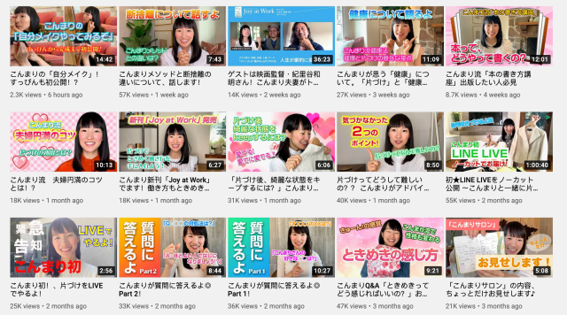
As you can see, the difference is quite startling. The calm, subdued tones of KonMari’s international channel are replaced with bright, colourful thumbnails that are covered in text.
But the differences don’t end there. The content shown in the videos still largely revolve around tidying up and sparking joy (or tokimeki in Japanese), but the presentation is completely different.
Everything has changed, from the more upbeat background music, to the large text appearing throughout the video. Even the little sound effects give the video a very different feel to the minimalistic Marie Kondo many international fans are used to.
Japanese Twitter was amused at the stark difference between the two channels, and some offered their thoughts on why it was so.
“International viewers don’t all necessarily speak English, so that’s why the thumbnails don’t have any writing on them.”
“If you look out over a Japanese cityscape, so many neon signs from pachinko parlours, billboards are all vivid and bright. I can see why this style would appeal to Japanese people.”
“Even her make-up is different in the two channels!”
“I think a lot of Japanese people would prefer the more simple thumbnails. Looking at Japanese thumbnails all the time can wear you out.”
“You can understand the content of the video a lot quicker by looking at the Japanese thumbnails.”
“Wow, she’s even decluttering her thumbnails, huh.”
Which thumbnails spark joy for you? Are you a fan of the muted tones, or do you prefer the vibrant colours? And are you a fan of the KonMari method, or are you more of a wasteland-inhabiting slob like our Japanese-language reporter Seiji Nakazawa?
Source: Twitter@aomuro2nd via Jin
Top image: YouTube/Marie Kondo
Insert images: YouTube/Marie Kondo, YouTube/【公式】こんまりちゃんねる,
● Want to hear about SoraNews24’s latest articles as soon as they’re published? Follow us on Facebook and Twitter!
 The Marie Kondo story: How a Japanese girl became an overnight celebrity with a hit show on Netflix
 “Tidying up” master Marie Kondo sparks controversy, not joy, by opening online knick-knack shop
 Marie Kondo helps Donald Trump tidy up the White House 【Video】
 What’s the secret to Marie Kondo’s popularity in America? Our Japanese-language reporter wonders
 Japanese company proposes Marie Kondo as mascot for new “Spark Joy” police taser weapons
 Japanese convenience store releases Japanese convenience store-flavor fried chicken
 Cup Noodle releases cold-water instant ramen in Japan, but can it really be made with just cold water?
 Hatsune Miku collaborates with Hokusai’s art in new Vocaloid ukiyo-e illustration series [Pics]
 Japan’s “edible fireworks” wagashi sweets return, but only for a limited time [Photos]
 Studio Ghibli releases anime T-shirts that pay homage to one of Hayao Miyazaki’s most personal films
 Japan now has human refrigerators inspired by Japanese vending machines
 Giant Snorlax, other snoozing Pokémon appear in Yokohama for Pokémon Sleeping Faces Research [Pics]
 Japan’s popular curry chain Cocoichi has an elusive delivery-only noodle menu
 Family Mart’s new Tokyo flagship convenience store doesn’t feel convenient, but is that a problem?
 Starbucks Japan unveils new peach milk pudding drink that’s like a decadent dessert
 Cup Noodle unveils first-ever cold-water instant ramen in Japan
 Starbucks Japan releases new Discovery Series collection celebrating local regions and traditions
 Teen girl in Japan refuses to be victim, personally escorts train pervert to police for arrest
 Japanese government ID card and app to be required for certain Pokémon card purchases next month
 Is Japan’s tourism boom slowing down? Foreign visitor numbers fall for first time in five years
 Japan announces sudden 400-percent increase in visa fees for foreigners entering the country
 Studio Ghibli has a new anime out, and there’s only one place in the world where you can see it
 Salomon releases Japan-exclusive Mt. Fuji hiking gear that doubles as an amazing souvenir
 Japanese ninja certification exam attracts 131 candidates from Japan and abroad
 Japan triples departure tax, foreign tourists and locals now must pay more to leave country
 Family Mart opens new “Famima” flagship store in Tokyo that’s like a tourist attraction
 Japan’s human washing machines will go on sale to general public, demos to be held in Tokyo
 Starbucks Japan releases new drinkware and goods for Valentine’s Day
 Starbucks Japan releases new sakura goods and drinkware for cherry blossom season 2026
 Japan’s newest Shinkansen has no seats…or passengers [Video]
 Put sesame oil in your coffee? Japanese maker says it’s the best way to start your day【Taste test】
 Japan reportedly adding Japanese language skill requirement to most common foreigner work visa
 Tidying expert Maire Kondo teams up with budget store 3Coins for a home organization line
 Mari-chan the sensational Shiba Inu actress is back and cute as ever
 Rock princess Avril Lavigne takes us back to 2002 with performance on Japanese YouTube channel
 Learn Japanese from YouTube: Amp up your listening skills with this four-step guide
 YouTube video about home-grown, home-cooked, traditional Chinese food causes major controversy
 Japanese comedian Naomi Watanabe has a livestream YouTube channel, and fans are living for it