Organizers find a way to let vision-impaired kids express their opinion of which of the adorable characters best represents Japan.
2020 Olympics (Page 4)
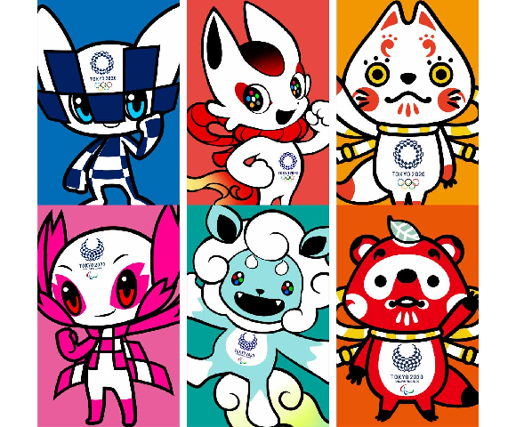
These six mascots take their inspiration from sakura cherry blossoms, shrines, and Japanese fairy tales.
Chairman singles out two aspects of Japanese traditional culture that people of other nations “wouldn’t understand.”
One of the bleakest depictions of Tokyo in all of film is part of Olympics celebration projection mapping project.
Japan hasn’t hosted the Summer Olympics since 1964; three years from now marks their big chance to impress everyone on the world stage.
The ashtrays in front of Japanese convenience stores aren’t there for people to smoke around.
After some seriously high-profile involvement, Nintendo characters aren’t part of newest promotional push for 2020 event.
Proposed tax hike aims to reduce the number of people lighting up before the Olympic flame comes to Tokyo.
The pallor of smoke that covers so many restaurants and bars in Japan may become a thing of the past.
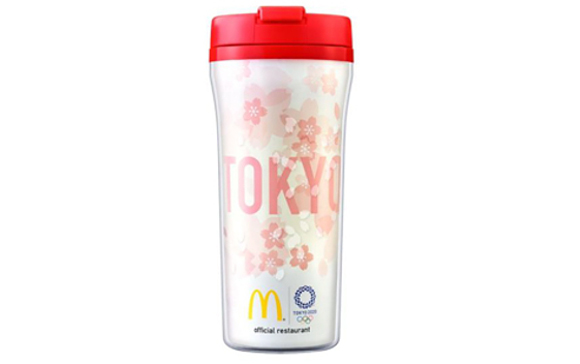
The three new designs give us a sneak peek at what McDonald’s has in store for the Tokyo Olympic Games.
It seems controversy over the new National Stadium for the Tokyo 2020 Olympics isn’t over yet.
There hasn’t been a lot of love for the 2020 Tokyo Olympics’ logo, which was officially unveiled by the event’s Organising Committee at the tail-end of July. Almost immediately after getting their first eyeful of it, many in Japan called it unappealing and confusing, and just a few days later some were calling it plagiarized.
In other words, not too many people were looking forward to seeing the emblem plastered all over the city during the Games, as well as the years leading up to them. The good news for the logo’s detractors is that they probably won’t have to, as the organizers of the Tokyo Olympics seem ready to officially withdraw the design for their promotion.
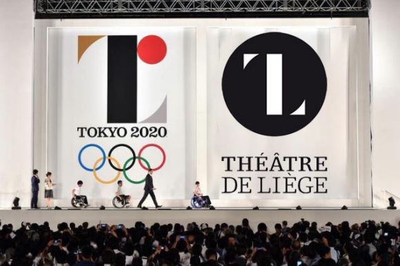
It’s been a rocky debut for the 2020 Tokyo Olympics official logo. First, it elicited mixed reactions as to whether its somewhat obtuse aesthetics really conveyed the noble sentiments it was aiming for. Then came the allegations that the logo was plagiarized from the emblem of a Belgian theater.
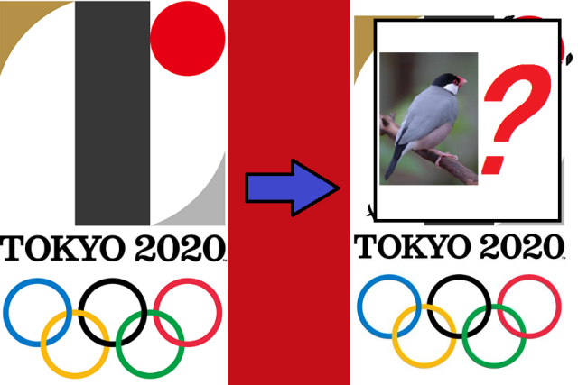
But let’s set aside the issue of whether or not the design is a copy or not and ask another artistic question: Is the Tokyo Olympics logo actually an adorably stylized bird?
Last Friday the logo was revealed for Tokyo’s 2020 Olympic and Paralympic Games. It was received with mixed reviews, with many of the opinion that the aesthetic thought that went into the logo wasn’t quite as deep as the message behind it.
As if there wasn’t already enough debate about the execution of the logo design itself, now there are rumors that the design could possibly be a plagiarization of the work of French designer Oliver Debie.
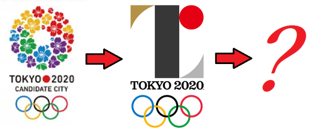
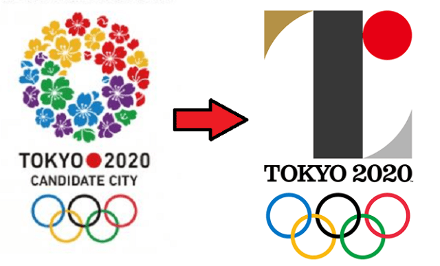
Back before Tokyo was selected as the host of the 2020 Olympics and Paralympics, the organizing committee started putting up posters around the capital touting its status as a candidate city. The logo was a circle of cherry blossoms using four of the five colors of the Olympic rings (with purple substituting for black).
You could say it was a clichéd choice, but on the other hand, it’d be hard to come up with a symbol more instantly associated with Japan than the sakura. Mt. Fuji, maybe, but it isn’t in Tokyo, and a piece of sushi would look more like a promotion for a restaurant than a sporting competition.
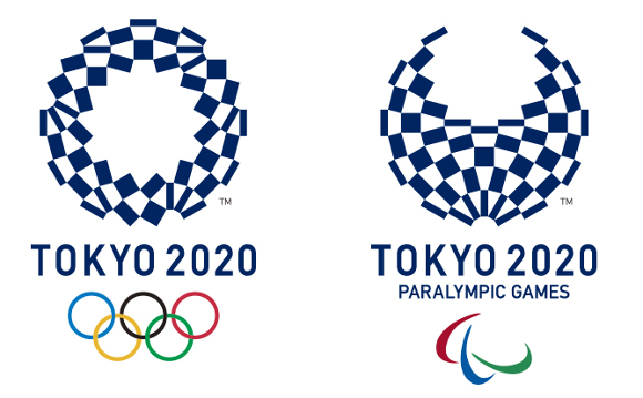
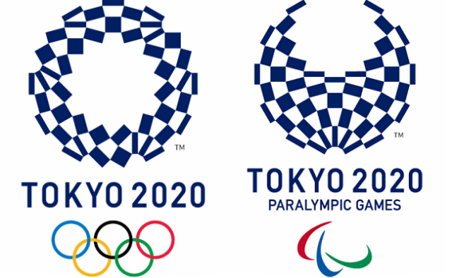
But perhaps because the cherry blossoms bloom in spring and Tokyo is hosting the Summer Games, the sakura ring isn’t going to be used for the actual 2020 Olympics and Paralympics themselves. Instead, Japan’s Olympic Committee recently came up with two new logos. In the eyes of some people in Japan, however, even though the designs embody a deep message, they’re lacking in aesthetic sense.








 7-Eleven Japan releases a crazy new viral sandwich: Chocolate Sprinkles and Whipped Cream
 Ramen restaurant in top Tokyo tourist neighborhood skips price gouging, but how does it taste?
 Japan now has a “for foreign tourists only” Mt. Fuji sightseeing train[Video]
 Studio Ghibli releases the My Neighbour Totoro tea caddy, with a magical self-closing lid
 Say hello to Japan’s new generation of adults, fresh from Kitakyushu’s 2023 seijinshiki ceremony
 Ghibli Museum building becomes a cuddly cushion
 Google made a free-to-play ninja cat RPG to celebrate the Tokyo Olympics, and it’s awesome!
 Cherry blossoms begin blooming in Japan with record-early starts for sakura season
 Totoro ocarinas on sale from Ghibli Museum online shop, and no two are exactly alike【Video】
 Japanese onsen egg maker from 100-yen store Daiso needs to be on your shopping list
 Starbucks Japan releases new My Fruit³ Frappuccino at only 34 stores around the country
 Tokyo government organizes food truck event to clear out delinquent/homeless teen gathering area
 Nine amazing off-the-beaten-path cherry blossom spots in Japan for yaezakura and shidarezakura
 Stunning central Japan wisteria festival is like a purple fantasy straight out of a Ghibli movie
 Create a tiny Ghibli anime world on your bookshelf with new miniature papercraft art kits
 When will the cherry blossoms reach full bloom in Japan this year?[Forecast]
 Starbucks Japan unveils new sakura cherry blossom collection for hanami season 2026
 Train station platform ramen store closes its doors on half a century of history in Tokyo
 Studio Ghibli releases Catbus pullback keychain that runs like the anime character
 Nine great places to see spring flowers in Japan, as chosen by travelers (with almost no sakura)
 Starbucks Japan releases first-ever Hinamatsuri Girls’ Day Frappuccino
 Studio Ghibli adds new Mother’s Day gift sets to its anime collection in Japan
 Virtual idol Hatsune Miku redesigned with look that adds new elements and brings back old ones
 Survey asks foreign tourists what bothered them in Japan, more than half gave same answer
 Japan’s human washing machines will go on sale to general public, demos to be held in Tokyo
 Starbucks Japan releases new drinkware and goods for Valentine’s Day
 We deeply regret going into this tunnel on our walk in the mountains of Japan
 Studio Ghibli releases Kodama forest spirits from Princess Mononoke to light up your home
 Starbucks Japan releases new sakura goods and drinkware for cherry blossom season 2026
 Japan’s newest Shinkansen has no seats…or passengers [Video]
 Major Japanese hotel chain says reservations via overseas booking sites may not be valid
 Put sesame oil in your coffee? Japanese maker says it’s the best way to start your day【Taste test】
 No more using real katana for tourism activities, Japan’s National Police Agency says
 Say hello to Japan’s new generation of adults, fresh from Kitakyushu’s 2023 seijinshiki ceremony
 Ghibli Museum building becomes a cuddly cushion
 Google made a free-to-play ninja cat RPG to celebrate the Tokyo Olympics, and it’s awesome!
 Cherry blossoms begin blooming in Japan with record-early starts for sakura season
 Totoro ocarinas on sale from Ghibli Museum online shop, and no two are exactly alike【Video】
 Why you should be adding Calpis to your beer in Japan
 New service lets you turn manga pages into T-shirt designs, over 200 titles to choose from
 Face to face with Ibaraki’s giant Daidarabotchi, not so bad after all and a bit of a looker
 Mister Donut’s revolutionary new Zaku Mocchi Ring doughnuts are amazing
 Krispy Kreme releases a very Japanese rice doughnut for Matcha Day
 Starbucks Japan releases new sakura drink for cherry blossom season 2025
 Princesses, fruits, and blacksmiths: Study reveals the 30 most unusual family names in Japan