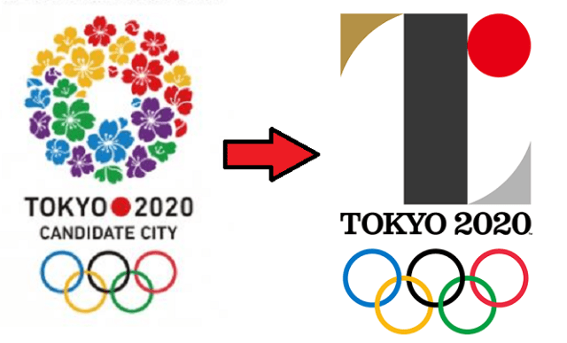
Back before Tokyo was selected as the host of the 2020 Olympics and Paralympics, the organizing committee started putting up posters around the capital touting its status as a candidate city. The logo was a circle of cherry blossoms using four of the five colors of the Olympic rings (with purple substituting for black).
You could say it was a clichéd choice, but on the other hand, it’d be hard to come up with a symbol more instantly associated with Japan than the sakura. Mt. Fuji, maybe, but it isn’t in Tokyo, and a piece of sushi would look more like a promotion for a restaurant than a sporting competition.
But perhaps because the cherry blossoms bloom in spring and Tokyo is hosting the Summer Games, the sakura ring isn’t going to be used for the actual 2020 Olympics and Paralympics themselves. Instead, Japan’s Olympic Committee recently came up with two new logos. In the eyes of some people in Japan, however, even though the designs embody a deep message, they’re lacking in aesthetic sense.






 One of Japan’s most beautiful hot spring towns announces new limits on number of day trippers
 Ghibli’s Princess Mononoke teams up with Foxfire for outdoor apparel collaboration【Photos】
 Flying dango: Unique tourist site where Japanese sweets are flown to you over a gorge
 Tokyo park’s sea of clouds, nighttime illumination, and cosplay days make now perfect time to visit
 Mario Kart Happy Meal toys arrive at McDonald’s Japan, and SoraNews24 has the whole set!【Photos】
 Mickey Mouse in now a transforming robot created by the designer of Gundam【Photos】
 American jackass tourist arrested after carving name into gate at Tokyo’s Meiji Shrine【Video】
 Kyoto becomes City of Yokai, with Night Parade of One Hundred Demons festival this autumn
 Beautiful Japanese garden green tea crepes waiting in Tokyo’s historical Asakusa neighborhood
 Cheeseburger rice bowls arrive at Japanese beef bowl chain Matsuya, and in our stomach【Taste test】
 Sanrio and magical girl anime PreCure join forces for new merch line【Photos】
 Ghibli Park debuts first winter illumination display with Howl’s Moving Castle theme
 Japanese job-quitting service contacted by other job-quitting service because employee wants to quit
 After cancelling Halloween, Tokyo’s Shibuya neighborhood cancels New Year’s Eve too
 New Ghibli papercraft kit gives you a little Princess Mononoke forest on your desk【Photos】
 Tokyo restaurant isn’t kidding about the name of its overflowing rare wagyu-ju【Photos】
 Off-the-beaten-tourist-track observatory tower in Tokyo has great views of the city…for free!
 Starbucks releases new Wicked tumblers in Japan
 Japan’s Pokémon donuts are evolving as Diglett grows into Dugtrio churro!
 Nintendo’s controller capsule toys are so cool, even the machine you buy them from is awesome【Pics】
 Tokyo Disneyland loses top-attendance crown for Japanese theme parks for second year in a row
 Pringles releases a limited-edition sweet flavour in Japan
 What’s the deal with akebi, the perfectly purple, alien-like fruit that’s in season now in Japan?
 McDonald’s new Happy Meals offer up cute and practical Sanrio lifestyle goods
 Foreign tourists on Shinkansen bullet train break suitcase etiquette, angering local passengers
 [Deleted] Article written for April Fool’s Day 2018
 Japanese government to make first change to romanization spelling rules since the 1950s
 Foreigner’s request for help in Tokyo makes us sad for the state of society
 Ghibli founders Toshio Suzuki and Hayao Miyazaki contribute to Japanese whisky Totoro label design
 Japanese convenience store Family Mart announces abolishment of eat-in spaces
 Princesses, fruits, and blacksmiths: Study reveals the 30 most unusual family names in Japan
 Life-size vibrating Legend of Zelda Master Sword for sale from Nintendo【Photos】
 Doraemon found buried at sea as scene from 1993 anime becomes real life【Photos】
 Mickey Mouse in now a transforming robot created by the designer of Gundam【Photos】
 American jackass tourist arrested after carving name into gate at Tokyo’s Meiji Shrine【Video】
 Kyoto becomes City of Yokai, with Night Parade of One Hundred Demons festival this autumn
 Beautiful Japanese garden green tea crepes waiting in Tokyo’s historical Asakusa neighborhood
 Cheeseburger rice bowls arrive at Japanese beef bowl chain Matsuya, and in our stomach【Taste test】
 Samurai ritual suicide contest cancelled by organizer in west Japan
 After cancelling Halloween, Tokyo’s Shibuya neighborhood cancels New Year’s Eve too
 Burger King Japan creates Kyoto Whopper, its most Japanese burger ever, with Kyoto rice merchant
 Japan’s “all-you-can-quit” job-quitting service not what it seems, is also sneakily hard to quit
 Gacha capsule toy paradise for adults appears at Akihabara Station
 The best Japanese cosplayers from Day 4 of Winter Comiket 2019【Photos】
 New Ghibli papercraft kit gives you a little Princess Mononoke forest on your desk【Photos】