
The first time I went to Tokyo alone, I got lost within the first five minutes of arriving at Shinjuku Station, unable to comprehend why there were so many transfers to different lines going in different directions. Without mobile data on my phone, I was basically one of the ‘internet-less lost gaijin’ crippled by the lack of Google Maps who ended up befriending the station master at every transfer station because, without them, I would probably have had to spend the night hanging out with the buskers on the streets.
The maps in Japanese subway stations are not only confusing, they also look like multi-colored spaghetti or weird roller coasters, and I can clearly recall thinking how nice it would be to have a better-looking representation of the city’s train lines. Thankfully, it looks like South Korean design company Zero per Zero has fulfilled my wish with their subway map designs, which are becoming a hot topic on Reddit.


 This Tokyo rice ball takes 20 years to make and 2,000 yen (US$14.30) to buy, but is it worth it?
 Ultimate lazy sukiyaki – Can you make the king of Japanese hot pots in a rice cooker?【Taste test】
 Kyoto becomes City of Yokai, with Night Parade of One Hundred Demons festival this autumn
 Japan’s super-cheap corn snacks apologize for second-ever price increase in 45 years
 Japanese chanko ramen restaurant contains a moving relic from the World Trade Center
 Right now is the peak time to go to Tokyo’s most-beautiful-view beer garden【Photos】
 Animated video looks at 40 years of women’s fashions in Japan as Tokyo landmark gets set to close
 Japan’s amazing egg sandwiches sold from self-serve roadside fridges have an inspiring backstory
 Japanese woman subdues convenience store thief with headlock, credits anime for technique
 KFC Genshin Impact fried chicken combo meals now on sale in Japan
 Pizza Hut adds a “Guilty Secret” sandwich to its menu for a limited time
 New Jimmy Choo x Sailor Moon collaboration brings anime magic to bags, shoes and accessories
 Game over for Classic Mini Famicom and Super Famicom as Nintendo announces end of repairs
 Give yourself a Totoro belly with Studio Ghibli’s Marshmallow Haramaki belly wraps
 Nintendo Museum’s official merch includes awesome giant controller cushions【Video】
 Studio Ghibli releases free-download board game — Here’s how to play it without reading Japanese
 Studio Ghibli lets you cosplay as Howl from Howl’s Moving Castle with cosy anime fashion range
 New Hello Kitty McDonald’s Japan Happy Meal toys are here, and Kitty’s sister is part of the set
 Starbucks teams up with the oldest of Japan’s Six Ancient Kilns to create a Bizen ware coffee mug
 One of Tokyo’s most beautiful gardens gets its own moon for moon-viewing season
 Matsushima restaurant offers all-you-can-eat sashimi in as many ways as you can dream it【Photos】
 Super budget-friendly retro Tokyo hotel feels like having your own 1960s Asakusa apartment
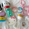 McDonald’s new Happy Meals offer up cute and practical Sanrio lifestyle goods
 Foreign tourists on Shinkansen bullet train break suitcase etiquette, angering local passengers
 Japanese government to make first change to romanization spelling rules since the 1950s
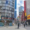 Foreigner’s request for help in Tokyo makes us sad for the state of society
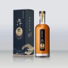 Ghibli founders Toshio Suzuki and Hayao Miyazaki contribute to Japanese whisky Totoro label design
 Doraemon found buried at sea as scene from 1993 anime becomes real life【Photos】
 Tokyo’s most famous Starbucks is closed
 Princesses, fruits, and blacksmiths: Study reveals the 30 most unusual family names in Japan
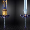 Life-size vibrating Legend of Zelda Master Sword for sale from Nintendo【Photos】
 Right now is the peak time to go to Tokyo’s most-beautiful-view beer garden【Photos】
 Animated video looks at 40 years of women’s fashions in Japan as Tokyo landmark gets set to close
 Japan’s amazing egg sandwiches sold from self-serve roadside fridges have an inspiring backstory
 Japanese woman subdues convenience store thief with headlock, credits anime for technique
 KFC Genshin Impact fried chicken combo meals now on sale in Japan
 Studio Ghibli releases giant Totoro plushies in Japan
 Shizuoka’s local Cherry Beans Potato French fries are just plain devilishly good
 Survey reveals Japan’s Generation Z dresses for social media, not for self-expression
 Onigiri in Paris: Small lunch shop brings traditional Japanese rice balls to France
 Japan’s new difficult-to-drink-from beer glass protects your liver, but it’s a brutal experience
 Hooters closing original location in Japan as large-chested chain’s downsizing continues
 Is this frozen tonkatsu sandwich vending machine really worth 700 yen?【Taste test】